|
Results and Discussion
Temporal land use changes are given in Table 2. Figures 4 and 5 depict the temporal dynamics during 1973 to 2010. This illustrates that the urban land (%) is increasing in all directions due to the policy decisions of industrialization and consequent housing requirements in the periphery. The urban growth is concentric at the center and dispersed growth in the periphery. Table 3 illustrates the accuracy assessment for the supervised classified images of 1973, 1992, 1999, 2003, 2008 and 2010 with an overall accuracy of 93.6%, 79.52%, 88.26%, 85.85%, 99.71%, and 82.73%.
Table 2 illustrates that the percentage of urban has increased from 1.87(1973) to 28.47% (2010) whereas the vegetation has decreased from 62.38 to 36.48%.
Table 2.a: Temporal land use of Bangalore in %
| Land use Type |
Urban |
Vegetation |
Water |
Others |
| Year |
% |
% |
% |
% |
| 1973 |
1.87 |
62.38 |
3.31 |
32.45 |
| 1992 |
8.22 |
58.80 |
1.45 |
31.53 |
| 1999 |
16.06 |
41.47 |
1.11 |
41.35 |
| 2003 |
19.7 |
38.81 |
0.37 |
41.12 |
| 2008 |
24.94 |
38.27 |
0.53 |
36.25 |
| 2010 |
28.97 |
36.48 |
0.79 |
34.27 |
Table 2.b: Temporal land use of Bangalore in hectares
| Land use |
Urban |
Vegetation |
Water |
Others |
| Year |
Ha |
Ha |
Ha |
Ha |
| 1973 |
3744.72 |
125116.74 |
6630.12 |
65091.6 |
| 1992 |
17314.11 |
123852.87 |
3063.69 |
66406.5 |
| 1999 |
32270.67 |
83321.65 |
2238.21 |
83083.05 |
| 2003 |
39576.06 |
77985.63 |
748.26 |
82611.18 |
| 2008 |
50115.96 |
76901.94 |
1065.42 |
72837.81 |
| 2010 |
57208.14 |
73286.46 |
1577.61 |
68848.92 |
Table 3: Accuracy assessment
| Year |
Kappa coefficient |
Overall accuracy (%) |
| 1973 |
0.88 |
93.6 |
| 1992 |
0.63 |
79.52 |
| 1999 |
0.82 |
88.26 |
| 2003 |
0.77 |
85.85 |
| 2008 |
0.99 |
99.71 |
| 2010 |
0.74 |
82.73 |
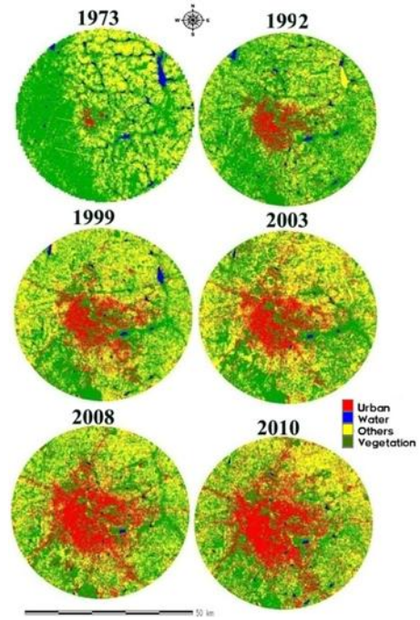
Fig. 4. Bangalore from 1973, 1992, 1999, 2003, 2008 and 2010
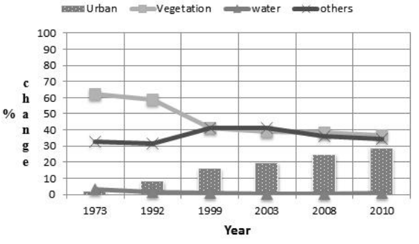
Fig. 5. Land use dynamics for Bangalore from 1973 to 2010
Land use Dynamics of Bangalore from 1973-2010
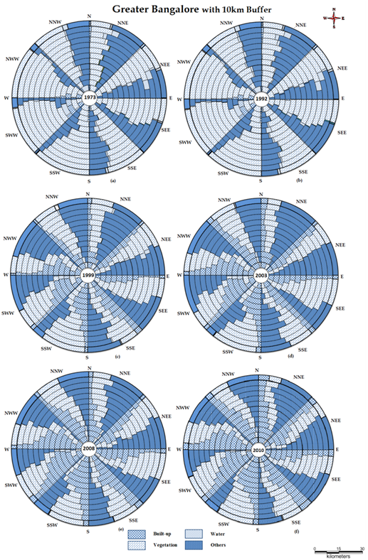
Figure 6 (in Appendix II) explains the spatio temporal land use dynamics of Greater Bangalore with 10 kilometer buffer region for the period 1973to 2010. The built-up percentage (urban) in circle 1 is increasing (from 1973 to 2010) in all directions with the decline of vegetation. In 1973 built-up is high in NNE (25.37%), NWW (17.45%), NNW (43.25%) directions whereas in 2010 built-up has increased in NNE (79.02%), SSW (74.11%), NWW (76.89%), NNW (85.71%) directions due to compact growth of residential areas, commercial complex areas. Infilling is observed in these regions during 1973 to 2010 due to conversion of open spaces and vegetated areas in to built-up. The urban land is increasing in all directions in Circle 2, due to more residential areas like Shantinagar, Majestic, Seshadripuram etc., In 1973 built-up is high in SSW (11.33%), SWW (47.05%), NWW (18.96%) directions whereas in 2010 built-up has increased in NNE (90.00%), SSW (78.25%), SWW (78.30%) directions, declining the vegetation cover in the region. In 1973 built-up is high in SSW (39.94%), NWW (33.03%) directions in Circle 3 whereas in 2010 built-up has increased substantially in NNE (89.24%), SSW (71.06%), SWW (92.06%), NWW (83.73%), NNW (69.39%) directions, which in turn show decline of vegetation cover in the region. The urban land has increased in all directions due to increase in residential and commercial areas like Gandhinagar, Guttahalli, Wilson Garden, KR Market, Kormangala (some of the IT industries are located in this region ) etc. It has been observed infilling urban growth in the region due to more commercial/financial services/activities. Land use changes in the circle 4 during 1973 to 2010 indicate an increase of urban land in all directions due to dense residential areas like Malleswaram, Rajajinagar, Jayanagar, Yeshwanthpur and small scale industries estates like Rajajinagar Industrial area, Yeshwanthpur Industrial suburb etc,. In the year 1973 built-up percentage is high in SEE (5.06%) and NWW (7.81%) directions whereas in 2010 built-up is more in NEE (77.06%), SSW (89.69%), SWW (92.39%), NWW (83.61%) directions, which in turn declining in the area of vegetation cover and water bodies in the region. In 1973, the area under built-up is less in all the direction in Circle 5 whereas in 2010, built-up has increased substantially in SSW (84.02%), SWW (93.01%), NWW (83.03%) directions, decreasing the vegetation cover.
The urban land has increased in all directions due to the increase in residential and commercial areas like Vijaynagar, Dasarahalli, Banshankari, Marthahalli, BTM layout and Bommanahalli industrial area (IT & BT industries ) etc., in 1973 built-up in Circle 6 in NNW is 2.67% compared to all directions. In 2010 built-up has increased in SSW (68.12%), SWW (53.46%), NWW (66.90%) directions. The urban land is increasing in all directions due to more residential areas and commercial areas like Vidyaranyapuram, Jalahalli, Yelahanka satellite Town, HMT layout etc. Asia’s biggest Industrial area-Peenya Industrial estate located in this region (SWW, NWW). Infilling (Peenya Industries) and high expansion (other areas) is observed in this region.
The urban land is increasing with respect to all the directions due to residential area development as in Yelahanka new town, White Field, Tunganagar, MEI housing colony and small scale industries. In 1973 built-up in Circle 7 is very less, However, this has increased in 2010, in SSE (38.54%), SSW (37.72%), SWW (46.37%), NWW (63.71%) directions, which has resulted in the decline of vegetation cover and water bodies. In this region urban growth expansion due to manufacturing industrial activities is observed.
The built-up area is increasing all the directions from 1973 to 2010 in circle 8. Built-up direction wise are NNE (31.68%), SSE (32.90%), NWW (46.29%), NNW (32.29%) due to residential layouts and small scale industries.
The built-up area is increasing all the directions from 1973 to 2010. In 2010 Built-up area with respect to SSE (24.26%), SSW (21.26%), NWW (24.61%) directions has increased due to new residential areas of moderate density (Hoskote residential area) and industries (part of Bommasandra Industrial area). The built-up has increased from 1973 to 2010 in Circle 10. In 2010, Built-up has increased with respect to NNE (18.57%), SSE (22.46%), NWW (18.06%) directions due to small residential layouts, industries (part of Bommasandra Industrial area) of technical, transport and communication infrastructure. The built-up has increased in Circle 11 from 1973 to 2010 due to the land use changes from open spaces and land under vegetation to builtup. Small scale Industries near Anekal (SSE) is driving these changes. In 2010 Built-up percentage is high in NNE (16.48%), SSE (22.39%), NNW (13.35%) directions. Regions in Circle 12, in all directions have experienced the decline of water bodies and vegetation due to large scale small residential layouts and Jigani Industrial estate (located in SSE). The built-up has increased from 1973 to 2010, evident from the growth in SSE (22.09%), NNE (14.92%) and NEE (14.17%) directions during 2010.
Similar trend is observed in Circle 13 with the built up increase in SSE (21.43%), NNE (18.74%) directions due to small residential layouts, part of Jigani Industrial estate (SSE) and also residential complexes due to the proximity of Bengaluru International Airport (NNE).
Shannon’s entropy
The entropy calculated with respect to 13 circles in 4 directions is listed in table 4. The reference value is taken as Log (13) which is 1.114 and the computed Shannon’s entropy values closer to this, indicates of sprawl. Increasing entropy values from 1973 to 2010 shows dispersed growth of built-up area in the city with respect to 4 directions as we move towards the outskirts and this phenomenon is most prominent in SWW and NWW directions.
Table 4: Shannon entropy
| Direction |
NNE |
NEE |
SEE |
SSE |
SSW |
SWW |
NWW |
NNW |
| 1973 |
0.061 |
0.043 |
0.042 |
0.036 |
0.027 |
0.059 |
0.056 |
0.049 |
| 1992 |
0.159 |
0.122 |
0.142 |
0.165 |
0.186 |
0.2 |
0.219 |
0.146 |
| 1999 |
0.21 |
0.21 |
0.23 |
0.39 |
0.35 |
0.34 |
0.33 |
0.24 |
| 2003 |
0.3 |
0.25 |
0.27 |
0.33 |
0.36 |
0.4 |
0.45 |
0.37 |
| 2008 |
0.3 |
0.27 |
0.34 |
0.46 |
0.45 |
0.48 |
0.48 |
0.37 |
| 2010 |
0.46 |
0.32 |
0.38 |
0.5 |
0.5 |
0.5 |
0.54 |
0.44 |
| Year |
Reference value: 1.114 |
Landscape metrics Analysis and interpretation
The entropy values show of compact growth in certain pockets and dispersed growth at outskirts. In order to understand the process of urbanisation, spatial metrics (Table 1 in Appendix I) were computed. Metrics computed at the class level are helpful for understanding of landscape development for each class. The analysis of landscape metrics provided an overall summary of landscape composition and configuration.
Figure 7 to 15 (Appendix III) describes Patch area metrics. Figure 7 reflects the direction-wise temporal built-up area, while Figure 8 explains percentage of built-up. These figures illustrate the inner circles (1, 2, 3, and 4) having the higher values indicates concentrated growth in the core areas especially in SWW and NWW regions. However, there has been intense growth in all zones and in all circles inside the boundary from 1973 to 2010 and which leading to spread near the boundary and 10 kilometer buffer. The values of urban intensification in certain pockets near periphery suggest the implications of IT sector after 90’s (example: one such is the IT sector being established in the NEE & SEE regions). Patch indices (such as largest patch) is computed to understand the process of urbanisation as it provides an idea of aggregation or fragmented growth. Figure 9 and 10 shows largest patch index with respect to built-up (i.e. class level) and also with respect to the entire landscape.
In 1973, circle-3 of SWW direction has largest built-up patch, which is aggregating to form a single patch. In 2010 largest patches can be found in circle 4 to circle 12 indicating the process of urbanisation. In circle 12 with respect to all directions the largest patches are located due to new paved surfaces areas, among all NNW direction is having higher largest patch. Similar trend has been noticed for the largest patch with respect to whole landscape, which indicates of largest patch in SWW (circle 3) among one of the land use classes in 1973 and in NNE (circle 9) in 2010. In order to analyse the dimension of the urban patch and its growth intensity, Mean patch size (MPS) is computed, Results are as shown in Figure 11. MPS values are higher near the periphery in 1973 due to a single homogeneous patch. Whereas, it showed higher value near the center where urban patches were prominent and were less near periphery which indicated fragmented growth in the center in 2010.
Figure 12 shows number of patches (NP) of built-up area from 1973 to 2010. This is fragmentation based indices. Less NP in 1973 has increased in 2010 showing more fragmented patches which can be attributed to the sprawl at periphery (circle 6 to 13) with respect to all the directions. The more number of patches can be found in NNE direction of circle 6 and circle 12. The PD and NP indices are proportional to each other. Figure 13 shows patch density (PD) in built-up, which indicates lower values in 1973 and higher values in 2010 indicating fragmentation towards periphery. Figure 14 shows Patch area distribution coefficient of variation (PAD_CV) which indicates almost zero value (all patches in the landscape are the same size or there is only one patch) in 1973 with respect to all the directions in outer circles. This has been changed in 2010, with high PAD_CV indicating new different size patches in the landscape are present due to the intensified growth towards the outskirts with respect to all the directions. Figure 15 shows PAFRAC (Perimeter-Area Fractal Dimension) index from 1973 to 2010, which approaches 1 in all the directions, indicating of simple perimeters in the region.
Figure 16 to 20 (Appendix III) explains the Edge metrics to analyse the edge pattern of the landscape. Figure 16 shows Edge Density (ED), which shows an increase from circle 4 to 13 with respect to all directions from 1973 to 2010clarifies the landscape is having simple edges at center and becoming complex to the periphery due to large number of edges or fragments in the periphery. Figure 17 shows prominent AWMPFD in 2010 for the circle 4 in all directions. Circle 5 to Circle 8 in NNW approaches to value 2, which shows the shapes of the patches are having the convoluted perimeters. AWMPFD approaches to 1 for the shapes with simple perimeters, Perimeters that are simple indicate that there is homogeneous aggregation happening in this region. Perimeters that are complex shaped indicate the fragment that are being formed, which is most prominent in 2010.
Figure 18 shows PARA_AM, which illustrates fragmentation in the outer circles with higher values in all directions for all years and especially circle 11 of NNW direction has higher perimeter. Figure 19 and 20, shows MPFD (Mean Patch Fractal Dimension), covariance indicates that in 1973 the landscape with simple edges (almost square) has become complicated in 2010 with convoluted edges in all directions because of fragmentation and newly developing edges in the landscape.
Figure 21 to 23 (Appendix III) explains the shape complexity of the landscape by the utility of shape metrics. NLSI (Normalized Landscape Shape Index) which explain shape complexity of simple (in 1973) to complex in 2010 as shown in Figure 21 with respect to all directions. Figure 22 and Figure 23 shows MSI (Mean Shape Index) and AWMSI (Area Weighted Mean Shape Index) indices, which explains in 1973 the shape of landscape is simple i.e. almost square and in 2010 due to irregular patches the shape has become more complex in all directions of the outer circles.
Figure 24 to 28 (Appendix III) describes the clumpiness of the landscape in terms of the urban pattern. Figure 24 shows Clumpy Index. City is more clumped/Aggregated in the center with respect to all directions but disaggregated towards periphery indicates small fragments or urban sprawl. Circles 1, 2, 3 are clearly portraits the intensified growth of the region in respective directions.
Figure 25 shows higher ENN_AM (Euclidean nearest neighbour distance Area weighted mean) for 1973 which has reduced in all directions from 1973 to 2010 due to intermediate urban patches. The new industries and other development activities from 1992 to 2010 especially lead to establish new urban patches which lead to reduction of nearest neighbor distance of urban patches.
Figure 26 shows ENN_CV (Euclidean nearest neighbour distance coefficient of variation) Index from 1973 to 2010, which is another form of ENN_AM, and is expressed in terms of percentage. ENN_CV value is decreasing due to more unique intermediate urban patches coming up in the region with new built-up areas. Figure 27 illustrates AI (Aggregation) Index, which is similar to Figure 24 (clumpy index).
Figure 28 shows IJI (Interspersion and Juxtaposition) which is a measure of patch adjacency IJI values are increasing due to decrease in the neighbouring urban patch distance in all the directions in 2010 which is indicative of patches/fragments becomes a single patch i.e. maximal interspersion and equally adjacent to all other patch types that are present in the landscape.
Figure 29 and 30 (Appendix III) explains the open space indices, computed to assess the status of the landscape for accounting the open space and dominance of land use classes. Figure 29 shows Ratio of Open Space (ROS), which helps to understand the growth of urban region and its connected dynamics. ROS was higher in 1973 with respect to all the directions, especially in the periphery of 10 kilometerboundary. ROS decreases in the subsequent years and reaches dismal low values in 2010. Specifically, circles 1, 2, 3 , 4 shows the zero availability of open space indicating that the urban patch dominates the open area which causes limits spaces and congestion in the core urban area leading to the destruction of vegetation cover for construction purposes. This is also driving the migration from the city center towards periphery for new developmental activities. Figure 30 shows dominance index which increases considerably since 1973 and reaches considerably maximum value (in 2010) indicating that the urban category becoming the dominant land use in the landscape.
Finally, UII was calculated, which explains the growth rate at which the study area is urbanising temporally through years 1973 to 2010. The growth rate during 1973 to 1992 showed less intensification of urban whereas from 1992 to 2010 there has been a drastic increase. Table 5 explains the urban intensification temporally, revealing higher growth rates in NNE, NWW and NNW
Table 5: UII with respect to the previous time period
| Direction |
NNE |
NEE |
SEE |
SSE |
SSW |
SWW |
NWW |
NNW |
| Year |
1973-1992 |
0.26 |
0.19 |
0.26 |
0.33 |
0.45 |
0.45 |
0.51 |
0.26 |
| 1992-1999 |
0.43 |
0.71 |
0.76 |
2.19 |
1.51 |
1.22 |
1.11 |
0.78 |
| 1999-2003 |
1.36 |
0.06 |
0.62 |
0.04 |
0.33 |
1.18 |
2.25 |
2.17 |
| 2003-2008 |
0.04 |
0.35 |
1.06 |
1.27 |
1.43 |
1.33 |
0.56 |
0.27 |
| 2008-2010 |
6.1 |
1.66 |
1 |
1.29 |
2.05 |
0.96 |
2.61 |
2.35 |
Principal components analysis (PCA):
Principal component analysis (PCA) was carried out to reduce the number of dimensions in the data set while keeping best of the variance, and to identify the major independent dimensions of the landscape patterns [42], [43]. PCA is for reduction and interpretation of large multivariate data sets [44] with some underlying linear structure.PCA is adopted in landscape analysis to identify independent components of landscape structure, and cluster analysis to group the components and then calculated the universality, strength, and consistency of the identified landscape structure components [45]. PCA helped in prioritising representative spatial metrics that best reflect the landscape’s temporal changes.
PCA has removed effect of landscape composition, and the resulting components that are the major independent dimensions of landscape configuration. Plot of principal components (PC’s) in Figure 31 shows the combination of the categories with loadings. This contains the plotted component scores of each sample and the loading coefficients as eigenvectors. The largest percentage of variance was explained by metrics from PC1 and PC2. Principal component analysis illustrates the spatial pattern of patches. The combined PCA gives the most consistent metrics with high loadings across the landscape. The positive loadings explain the behaviour of fragmentation for respective circles and also compactness in some circles. These metrics are effective for discerning the patterns of urban growth at a landscape.
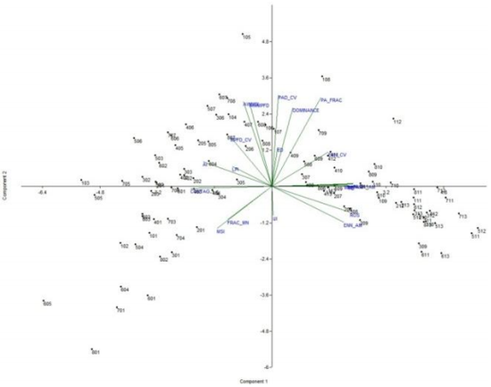
Fig. 31. PCA biplot of the first and second principal components. Dots correspond to the 104 samples (13 circles for 8 directions) of spatial metrics
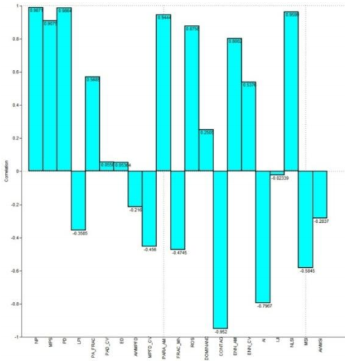
Fig. 31(a). PCA loadings with respect to each metrics
Computation of Canonical Correspondence Analysis (CCA):
Canonical Correspondence Analysis (CCA) an eigenvector ordination technique for multivariate direct gradient analysis [46-48] has been tried as CCA maximizes the correlation for summarising the joint variations in two sets of variables. An eigenvalue close to 1 will represent a high degree of correspondence and an eigenvalue close to zero will indicate very little correspondence. CCA is implemented considering the landscape metrics as variables with respect to 13 different circles in 8 directions and the outcome is given in Figure 32. This illustrates spatial arrangement of the patches within the study area, explained by percentage variance in the respective landscape metrics. Axis 1 explains 93.23% of variance and axis 2 explains 7.09% variance. The plot shows the metrics which are the influence factors for each circle with respect to the each direction. The positive axis explains the fragmentation based indices and negative axis shows the compactness.
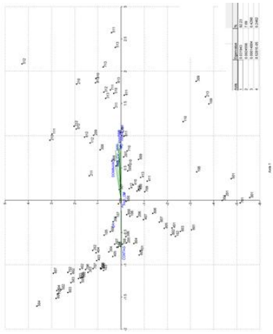
Fig. 32. CCA plot of the first and second axes with % variance
|
