|
Shannon’s entropy computed for Bangalore city, Peri-urban and outskirts (hence n = 3), together comprising Greater Bangalore for 1973, 1992, 2000 and 2006 are listed in Table 3. The entropy values obtained for 2000 and 2006, (1.0325 and 1.0782) are closer to the upper limit of log n, i.e. 1.0986, showing the higher degree of dispersion of built-up in the city. The urbanisation process increased in 2000 and 2006, indicating higher entropy value as the distribution of built-up during 2006 was more dispersed than in 1973 or 1992.
Table 3: Shannon’s entropy for Greater Bangalore
Year |
1973 |
1992 |
2000 |
2006 |
| Entropy |
0.9007 |
0.9023 |
1.0325 |
1.0782 |
| ln(n) |
1.0986 |
Supervised classification was performed using Bayesian classifier and was verified with field knowledge, visual interpretation and Google Earth image. The supervised classified images of 1973, 1992, 1999, 2000, 2002, 2006 and 2007 with an overall accuracy of 72%, 75%, 71%, 77%, 60%, 73% and 55% were obtained by using the open source programs (i.gensig, i.class and i.maxlik) of Geographic Resources Analysis Support System (http://wgbis.ces.iisc.ac.in/grass) as displayed in figure 4. The class statistics is given in table 4. The implementation of the classifier on Landsat, IRS and MODIS image helped in the digital data exploratory analysis as were also verified from field visits in July, 2007 and Google Earth image.
Table 4: Greater Bangalore land cover statistics
Class
Year  |
Built up |
Vegetation |
Water Bodies |
Others |
| 1973 |
Ha |
5448 |
46639 |
2324 |
13903 |
| % |
7.97 |
68.27 |
3.40 |
20.35 |
| 1992 |
Ha |
18650 |
31579 |
1790 |
16303 |
| % |
27.30 |
46.22 |
2.60 |
23.86 |
| 1999 |
Ha |
23532 |
31421 |
1574 |
11794 |
| % |
34.44 |
45.99 |
2.30 |
17.26 |
| 2000 |
Ha |
24163 |
31272 |
1542 |
11346 |
| % |
35.37 |
45.77 |
2.26 |
16.61 |
| 2002 |
Ha |
26992 |
28959 |
1218 |
11153 |
| % |
39.51 |
42.39 |
1.80 |
16.32 |
| 2006 |
Ha |
29535 |
19696 |
1073 |
18017 |
| % |
43.23 |
28.83 |
1.57 |
26.37 |
| 2007 |
Ha |
30876 |
17298 |
1005 |
19143 |
| % |
45.19 |
25.32 |
1.47 |
28.01 |
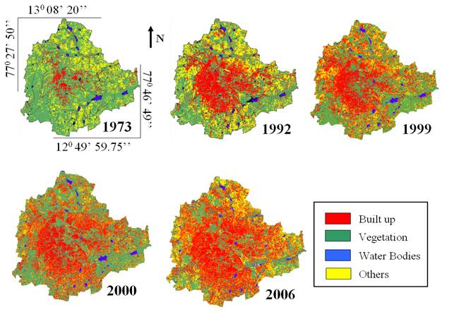
Figure 4: Temporal land use changes in Greater Bangalore
From the classified raster data, urban class was extracted and converted to vector representation for computation of precise area in hectares. There has been a 466% increase in built up area from 1973 to 2007 as evident from temporal analysis leading to a sharp decline of 61% area in water bodies in Greater Bangalore mostly attributing to intense urbanisation process. Figure 5 shows Greater Bangalore with 265 water bodies (in 1972). The rapid development of urban sprawl has many potentially detrimental effects including the loss of valuable agricultural and eco-sensitive (e.g. wetlands, forests) lands, enhanced energy consumption and greenhouse gas emissions from increasing private vehicle use. Vegetation has decreased by 32% from 1973 to 1992, by 38% from 1992 to 2002 and by 63% from 2002 to 2007.
Disappearance of water bodies or sharp decline in the number of waterbodies in Bangalore is mainly due to intense urbanisation and urban sprawl. Many lakes were unauthorisedly encroached for illegal buildings (54%). Field survey (during July-August 2007) shows that nearly 66% of lakes are sewage fed, 14% surrounded by slums and 72% showed loss of catchment area. Also, lake catchments were used as dumping yards for either municipal solid waste or building debris. The surrounding of these lakes have illegal constructions of buildings and most of the times, slum dwellers occupy the adjoining areas. At many sites, water is used for washing and household activities and even fishing was observed at one of these sites. Multi-storied buildings have come up on some lake beds that have totally intervene the natural catchment flow leading to sharp decline and deteriorating quality of waterbodies.
Figure 5: Greater Bangalore with 265 water bodies.
Urbanisation has telling influences on the natural resources evident from the sharp decline in number of water bodies and also from depleing groundwater table. Temporal analyses indicate the decline of 34.48% during 1973 to 1992, 56.90% during 1973-2002 and 70.69% of waterbodies during 1973-2007 in the erstwhile Bangalore city limits. Similar analyses done for Greater Bangalore (i.e Bangalore city with surrounding 8 municipalities) indicate the decline of 32.47% during 1973 to 1992, 53.76% during 1973-2002 and 60.83% during 1973-2007 (Table 5). This is correlated with the increase in built up area from the concentrated growth model focusing on Bangalore, adopted by the state machinery, affecting severely open spaces and in particular waterbodies. Some of the lakes have been restored by the city corporation and the concerned authorities in recent times. Figure 1, given earlier shows the rate of increase in built up from 1973 to 2007 and its implication on the decline of vegetation and water bodies.
Table 5: Status of water bodies in Bangalore city limits and Greater Bangalore
|
Bangalore City |
Greater Bangalore |
|
Number of
Water bodies |
Area (in ha) |
Number of
Water bodies |
Area (in ha) |
SOI |
58 |
406 |
207 |
2342 |
1973 |
51 |
321 |
159 |
2003 |
1992 |
38 |
207 |
147 |
1582 |
2002 |
25 |
135 |
107 |
1083 |
2007 |
17 |
87 |
93 |
918 |
The land cover features that have been classified using the ML estimates and Bayesian theory shows that builtup and vegetation are negatively correlated given by:
y = -8E-06x2 – 0.7362x + 50472, R2 = 0.9286 ….. (Equation 36)
where, y is the independent variable (builtup) and x is the dependent variable (vegetation). Builtup and water bodies are also negatively correlated as given by:
y= - 8E-07x2 – 0.0148x + 2111.9, R2 = 0.9953 ….. (Equation 37)
where, y is builtup (independent) and x is water bodies (dependent). Table 5 gives the details of the number of wetlands from 1973 to 2007.
Pattern classifiers were used to map waterbodies automatically from NIR bands of MODIS and Landsat remote sensing data. MODIS provided data of 2002 to 2007, while for 1973 and 1992, IR Bands of Landsat (79m and 30m spatial resolution) data were used. Principal Components of IR bands of MODIS (250 m) were fused with IRS LISS-3 NIR (23.5 m). To extract waterbodies, statistical unsupervised learning of IR bands for the respective temporal data was performed using Bayesian approach based on prior probability, mean and covariance. Spatial distribution of waterbodies on temporal scale is given in Figure 6. Temporal analysis of waterbodies indicate sharp decline of 58% in Greater Bangalore attributing to intense urbanisation process, evident from 466% increase in builtup area from 1973 to 2007.
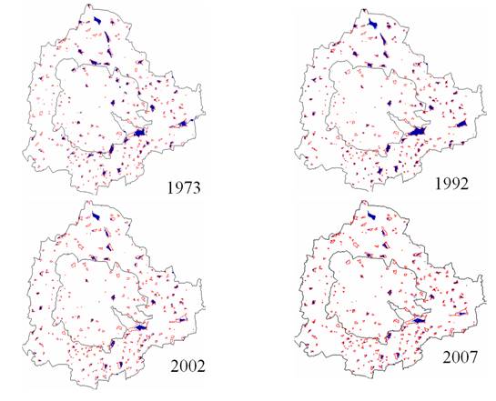
Figure 6: Spatio-temporal analysis of wetlands of Greater Bangalore. Water bodies are represented in blue and the vector layer of water bodies generated from SOI Toposheet is overlaid in red. The inner boundary (in black) is the Bangalore city limits and the outer boundary represents the spatial extent of Greater Bangalore.
Urbanisation and the consequent loss of lakes has led to decrease in catchment yield, water storage capacity, wetland area, number of migratory birds, flora and fauna diversity and ground water table. Studies in selected lake catchments in Bangalore reveal the decrease in depth of the ground water table from 10-12 m to 100-200 m in 20 years due to the disappearance of wetlands.
Reclamation of lakes for various developmental activities has resulted in the loss of interconnectivity in Bangalore district leading to higher instances of floods even during the normal rainfall. Analyses of Bellandur and Ulsoor drainage network (figure 7) showed that the network is lost due to conversion of Chelgatta tank into a golf course. Similarly the drainage network between Madivala and Bellandur revealed of encroachment and conversion that has resulted in the loss of connectivity between Yelchenhalli kere and Madivala (figure 8).
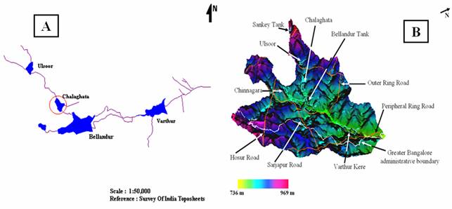
Figure 7: Ulsoor–Bellandur–Varthur (a) drainage network (b) lakes overlaid on 10 m DEM showing their missing interconnectivity
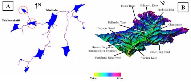
Figure 8: Madivala–Bellandur–Varthur (a) drainage network (b) lakes overlaid on 10 m DEM showing their missing interconnectivity
Increased peak discharge and higher frequency of floods are the consequences of urbanisation. As land is converted from fields to built up, it loses its ability to absorb rainfall. Urbanisation has increased runoff 2 to 6 times over what would occur on natural terrain in some pockets of Bangalore. During periods of urban flooding, streets become swift moving rivers, while low lying residential areas and basements become death traps as they fill with water. Conversion of water bodies to residential layouts has further exaggerated the problem.
Flooding in urban areas causes large damage at buildings and other public and private infrastructure (evident during 1997, 2002 and 2007). Besides, street flooding can limit or completely hinder the functioning of traffic systems and has indirect consequences such as loss of business and opportunity. The expected total damage; direct and indirect monetary damage costs as well as possible social consequences is related to the physical properties of the flood, i.e. the water level above ground level, the extent of flooding in terms of water volume escaping from or not being entering the drainage system, and the duration of flooding.
Ulsoor–Belandur catchment: This catchment has 6 lakes – Sankey, Ulsoor, Chalghata, Chinnagara and Varthur and was classified into three major land use types – built up, vegetation and others (comprising open land, waste land etc). The total rainfall yield in this catchment is 240 Mm3, percolated water is 90 Mm3 and water overflow is 150 Mm3. The SRTM DEM data were resampled to 10 m resolution and the volume of each lake was computed assuming the depth to be 1 m and the mean annual rainfall to be 850 mm. The total volume of all the 6 lakes in this catchment is 73 Mm3. Hence there is surplus overland flow of 77 Mm3, which cannot flow to downstream due to disruption of natural drainage (removal of lakes and blockage of storm water drains) resulting in flooding (even during normal rainfall).
Madivala–Varthur catchment: Similar analysis was done for Madivala catchment which has 14 lakes – Venkatapura, Yellakunte, Bandepalya, Begur Doddakere, Madivala, Hulimavu, Marenahalli, Govindanaikana kere, Tank north of Doresanipalya, Gittigere and Vaddarpalya. The total rainfall yield is 247 Mm3, percolated water is 97 Mm3 and the remaining 150 Mm3 water flows as overland flow and storage in lakes. The total volumes of all the lakes considering 1 m depth is 110 Mm3 resulting in the excess of 40 Mm3 from the catchment leading to artificial floods. In addition to rainfall, Belandur-Varthur watershed receives untreated municipal sewage to the order of 500MLD.
Landsat ETM+ data of 15 m spatial resolution (on fusing with Landsat ETM+ PAN) have been used to estimate impermeable areas that does not distinguish between types of urban land use (industrial, commercial and residential) but consist of a sample from a mixture of residential and commercial areas. Figure 9 shows the relation found between impermeable area to urban population density. Consequence of increase in built up pixels (evident from the increase in paved surface or impermeable area) is the increase of population density in a region.
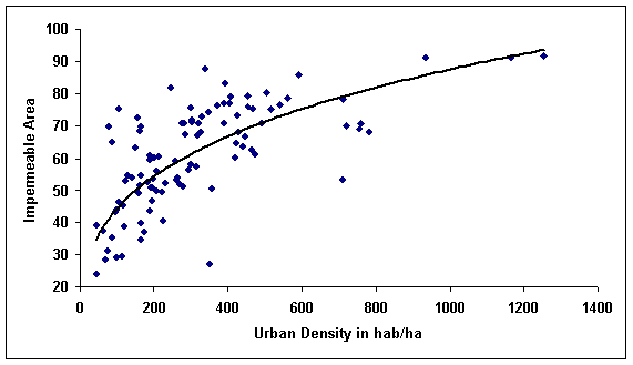
Figure 9: Impermeable area and urban density for Bangalore city
Also, due to increased paved surface and concentrated human activities the magnitude of the difference in observed ambient air temperature between urban pockets (artificial land surface) and the regions covered with vegetation (natural area), which is ascribed as urban heat island effect. The urban heat-island effect results in increased local atmospheric and surface temperatures in urban pockets compared to the surrounding open spaces, etc. Specifically, surface and atmospheric temperatures are increased by anthropogenic heat discharge due to energy consumption, increased land surface coverage by artificial materials having high heat capacities and conductivities, increased vehicular and industrial emissions and the associated decreases in vegetation and water pervious surfaces, which reduce surface temperature through evapotranspiration. An attempt is made here to understand the implications of land cover changes on local climate.
Computation of LST from Landsat TM/ETM+ and MODIS Thermal bands
LST were computed from Landsat TM and ETM thermal bands. The minimum and maximum temperatures from Landsat TM data of 1992 were 12 and 21 with a mean of 16.5±2.5 while for ETM+ data were 13.49 and 26.32 with a mean of 21.75±2.3. MODIS Land Surface Temperature/Emissivity (LST/E) data with 1 km spatial resolution with a data type of 16-bit unsigned integer were multiplied by a scale factor of 0.02 (http://lpdaac.usgs.gov/modis/dataproducts.asp#mod11). The corresponding temperatures for all data were converted to degree Celsius. Figure 10 shows the LST map and NDVI of Greater Bangalore in 1992, 2000 and 2007. The minimum and maximum temperatures were computed as 20.23, 28.29 and 23.79, 34.29 with a mean of 23.71±1.26, 28.86±1.60 for 2000 and 2007 respectively. Data were calibrated with in-situ measurements.
Computation of NDVI from Landsat TM/ETM+ and MODIS data
NDVI was computed from visible Red (0.0.63 – 0.69 μm) and NIR (0.76 – 0.90 μm) bands of Landsat TM (1992)/ETM+ (2000) and MODIS data (620 – 670 μm (Red) and 841 – 876 μm (NIR)) of 2007, so that the relationship between LST and NDVI can be studied (figure 10). NDVI for Landsat TM was 0.04±0.4543, for ETM+ was 0.0252±0.5369 and for MODIS was -0.0917±0.5131.
The correlation between NDVI and temperature of 1992 TM data was 0.88, 0.72 for MODIS 2000 and 0.65 for MODIS 2007 data respectively, suggesting that the extent of land cover with vegetation plays a significant role in the regional LST. Respective NDVI and LST for different land uses is given in table 6 and further analysis was carried out to understand the role of respective land uses in the regional LST’s. Temporal analysis showed a linear growth of 466% in number of urban pixels from 1973 to 2007 and a decline of 61% in the number of water bodies with a 63% decrease in vegetation cover. Simillarly during 1992 to 2007, the increase in built pixels was 63% while vegetation and waterbodies declined by 45 and 43.8% respectively. The increase in LST during 2002 and 2007 compared to 1992 could be mainly attributed to the increase in built up area and decline of area under vegetation and waterbodies in the region
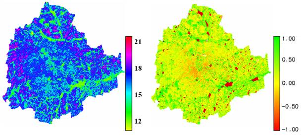
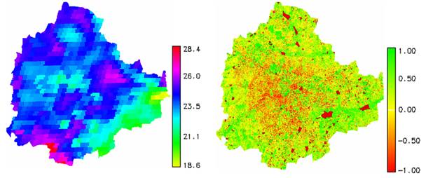
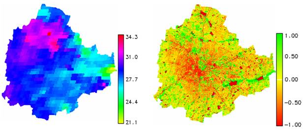
Figure 10: LST and NDVI from Landsat TM (1992), MODIS (2002 and 2007)
(Note: pixelisation of MODIS 2002 and 2007 is mainly due to coarse spatial resolution ~ 1 Km)
Table 6: LST (° C) and NDVI for various land uses
| Land use |
1992 (TM) |
2000 (MODIS) |
2007 (MODIS) |
LST
Mean±SD |
NDVI
Mean±SD |
LST
Mean±SD |
NDVI
Mean±SD |
LST
Mean±SD |
NDVI
Mean±SD |
| Built up |
19.03±
1.47 |
-0.162± 0.096 |
26.57±
1.25 |
-0.614±
0.359 |
31.24±
2.21 |
-0.607±
0.261 |
| Vegetation |
15.51±
1.05 |
0.467±
0.201 |
22.21±
1.49 |
0.626±
0.27 |
25.79±
0.44 |
0.348±
0.42 |
| Water bodies |
12.82±
0.62 |
-0.954±
0.055 |
21.27±
1.03 |
-0.881±
0.045 |
24.20±
0.27 |
-0. 81±
0.27 |
| Open ground |
17.66±
2.46 |
-0.106±
0.281 |
24.73±
1.56 |
-0.016±
0.283 |
28.85±
1.54 |
-0.097±
0.18 |
It is clear that urban areas that include commercial, industrial and residential land exhibited the highest temperature followed by open ground. Lowest temperatures were observed in water bodies across all years and vegetation. Spatial variation of NDVI is not only subject to the influence of vegetation amount, but also to topography, slope, solar radiation availability, and other factors (Walsh, et al., 1997). A closer look at the values of NDVI by land use category (table 6) indicates that the relationship between LST and NDVI may not be linear. Clearly, it is necessary to further examine the existing LST and vegetation abundance relationship using fraction as an indicator, which is discussed next.
Generation of Abundance maps through Linear Spectral unmixng
The Landsat ETM+ images (band 1, 2, 3, 4, 5 and 7) were unmixed through Linear unmixing to get the abundance maps of 5 classes (1) dense urban (commercial/industrial/residential), (2) mixed urban (that has some amount of vegetation present in between), (3) vegetation, (4) open ground and (5) water bodies. We considered only dense urban, mixed urban and vegetation abundance for further analysis as shown in figure 11. Minimum and maximum temperature from ETM+ data were 13.49 and 26.32 with a mean of 21.75±2.3.
These abundance images were further analysed to see their contribution to the UHI by separating the pixels that contains 0-20%, 20-40%, 40-60%, 60-80% and 80-100% of urban pixels. Table 7 gives the average LST for various land cover (LC) abundance classes.
Table 7: Mean LST for various Land use classes with varying abundances
Class
Abundance |
Mean Temperature± SD of dense urban |
Mean Temperature± SD
of mixed urban |
Mean Temperature± SD of vegetation |
| 0-20% |
21.99±2.37 |
21.57±2.36 |
17.91±2.19 |
| 20-40% |
22.06±2.15 |
21.58±2.36 |
17.39±1.37 |
| 40-60% |
22.27±2.00 |
21.67±2.41 |
17.22±0.89 |
| 60-80% |
22.33 ±2.22 |
22.28±2.02 |
17.13±0.85 |
| 80-100% |
22.47±1.96 |
22.37±2.17 |
17.12±0.91 |
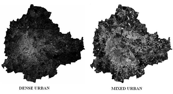
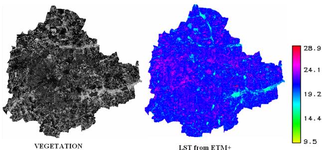
Figure 11: Abundance maps and LST obtained from Landsat ETM+ data.
The relationship between LST and NDVI was investigated for each LC type through the Pearson’s correlation coefficient at a pixel level and are listed in table 8. The significance of each correlation coefficient was determined using a one-tail Student’s t-test. It is apparent that values tend to negatively correlate with NDVI for all LC types. NDVI values for built up ranges from -0.05 to -0.6. Temporal increase in temperature with the increase in the number of urban pixels during 1992 to 2007 (63%) is confirmed with the increase in “r” values for the respective years. The NDVI for vegetation ranges from 0.15 to 0.6. Temporal analyses of the vegetation show a decline of 45%, which is reflected in the respective temperature increase and the respective ‘r’ values confirm the trend.
Table 8: Correlation coefficients between LST and NDVI by Land use type (p=0.05)
| Land use |
1992 |
2000 |
2007 |
| Built up |
-0.7188 |
-0.7745 |
-0.7900 |
| Vegetation |
-0.8720 |
-0.6211 |
-0.6071 |
| Open ground |
-0.6817 |
-0.5837 |
-0.6004 |
| Water bodies |
-0.4152 |
-0.4182 |
-0.4999 |
Relationship of population density with LST
The population data used in the analysis were from Census, 2000 coinciding with the acquisition of ETM+ data of 2000 from which LST were derived. Figure 12 provides the temperature profile for 100 wards with different population densities.
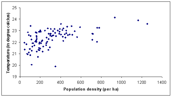
Figure 12: Ward wise temperature and population density
Increased urbanisation has resulted in higher population densities in certain wards, which incidentally have higher LST due to higher level of anthropogenic activities, which corroborate with the reports for Fukuoka City, Japan (Tanaka, et al., 2005).
Effect of different land use classes derived from combined outputs of Unmixed image and Bayesian classification on LST
The abundance output of the Landsat ETM+ images were combined with the signatures of the five classes that were collected from the ground and the Baye's classifier was used to obtain new improved land use map. The output of the unmixing algorithm controls the output of the Baye's classifier by providing the prior probability of each class for every pixel apart from the training pixels. Given a set of multispectral images the computation is done as follows:
- The abundances of all categories in the data are computed using an unmixing algorithm discussed earlier. For each pixel, abundance of each category is used as a prior probability of the class.
- Let x denote the multispectral observation vector and k any class.
- In the Baye's classifier for the multispectral data, the posterior probability of the class given the observation is computed by multiplying the prior probability of the class (obtained from the unmixing algorithm) with the conditional probability P(x|k). The class label assigned to the pixel is
 ….. (Equation 36) ….. (Equation 36)
In the conventional approach, the prior probability of all classes is assumed to be same for all pixels through out the image. This unmixing decision based approach, systematically exploits the information from both the sources for achieving more reliable classification. The output of this approach is shown in figure 13. Table 9 shows the LST, NDVI and correlation coefficients land use wise.
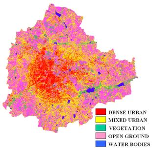
Figure 13: Classified image obtained from combining unmixed images and training data as input to Baye’s classifier with 6 multispectral bands of Landsat ETM+
Table 9: LST, NDVI and correlation coefficient for different land use classes.
| Landuse |
LST (Mean±SD) |
NDVI (Mean±SD) |
Correlation coefficient between LST and NDVI |
| Dense built up |
23.09±1.16 |
-0.2904±0.395 |
-0.7771 |
| Mixed built up |
22.14±1.06 |
-0.138±0.539 |
-0.6834 |
| Vegetation |
19.27±1.59 |
0.3969±0.404 |
-0.8500 |
| Open Ground |
22.40±1.97 |
-0.0193±0.164 |
-0.6319 |
| Water Bodies |
19.57±1.72 |
-0.301±0.47 |
0.2319 |
8 transacts were laid across the city in eight directions (north [N], north-east [NE], east [E], south-east [SE], south [S], south-west [SW], west [W] and north-west [NW]) as shown in figure 14 and LST were analysed to understand the temperature dynamics in different directions. Table 10 gives the LST Mean and SD in various directions.
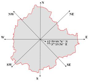
Figure 14: Transect lines superimposed on Greater Bangalore boundary
Table 10: LST across eight directions
| Direction |
Mean LST±SD |
| N |
21.30±2.39 |
| NE |
22.15±2.22 |
| E |
21.01±2.47 |
| SE |
21.34±2.30 |
| S |
21.71±2.07 |
| SW |
22.19±1.92 |
| W |
22.97±1.72 |
| NW |
22.07±2.25 |
Temperature profile was further analysed by overlaying the LST map on the Baye’s classified map to visualise the effect of different land uses. The temperature profile given in figure 15, show that for vegetation patch or water body temperature fell below the mean on the transact (marked with circle) beginning from the center of the city and moving outwards along the transact. Regions in SW, W, N and NE coincides with urban growth poles (due to intense urbanisations consequent to setting up of IT corridors and industrial plots in the region; likely increase in urban pixels would be 48% in N, 51% in NE, 41% S and 38% in SE directions as listed in table 11).
The dynamics of built up pixels from 1973 to 2007 in Greater Bangalore is presented in figure 16. The growth poles are evident in figure 17, which are false colour composites for 1973, 1992, 1999, 2000, 2002 and 2007 towards N, NE, S and SE indicating the intense urbanisation process due to growth agents like setting up of IT corridors, Peenya industrial units, etc. The growth in northern direction can be attributed to the new International Airport, encouraging other commercial and residential hubs. The southern part of the city is experiencing new residential and commercial layouts and the north-western part of the city outgrowth corresponds to the Peenya industrial belt along the Bangalore-Pune National Highway 4. The forecast of the growth of built up pixels in various directions for 2010, 2015 and 2020 are listed in table 11. Projected increase in urban pixels during the next 15 years would be 48% in N, 51% in NE, 41% S and 38% in SE directions.
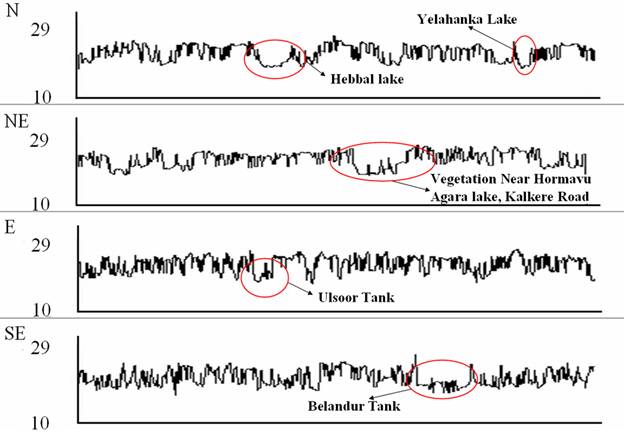
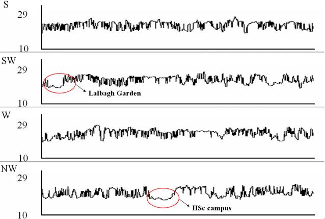
Figure 15: Temperature profile across N, NE, E, SE, S, SW, W and NW
(X axis – Movement along the transact from the city centre (see figure 14), Y axis - Temperature (°C))
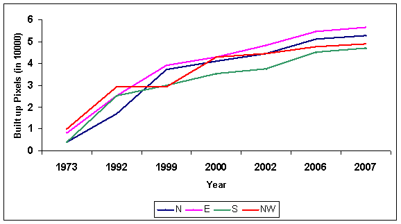
Figure 16: Temporal growth of built up pixels in various directions.
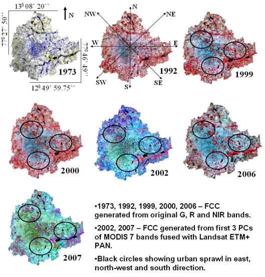
Figure 17: Temporal changes in built up area in Greater Bangalore (eight directions)
Table 11: Projections of growth (built up pixels) 2010, 2015 and 2020
| Direction |
Equation |
R2 |
Standard Error (ha) |
Increase in Built up Area (ha) |
| 2010 |
2015 |
2020 |
| N |
y = 2E-64e0.0786x |
0.98 |
505 |
7374 |
10924 |
16184 |
| NE |
y = 8E-69e0.0833x |
0.97 |
383 |
3737 |
5668 |
8597 |
| E |
y = 7E-47e0.0585x |
0.99 |
373 |
7343 |
9838 |
13180 |
| SE |
y = 1E-52e0.0648x |
0.99 |
293 |
3313 |
4581 |
6334 |
| S |
y = 4E-57e0.0701x |
0.97 |
244 |
5608 |
7963 |
11305 |
| SW |
y = 8E-22e0.0294x |
0.99 |
58.3 |
3323 |
3849 |
4459 |
| W |
y = 1E-21e0.0294x |
0.97 |
196 |
4154 |
4812 |
5573 |
| NW |
y = 8E-37e0.0468x |
0.95 |
411 |
5135 |
6489 |
8200 |
|