|
Results and Discussion
Vegetation cover of the study area was analysed through NDVI. Figure 3 illustrates that area under vegetation has declined from 72% (488 sq.km in 1973) to 21% (145 sq.km in 2010).
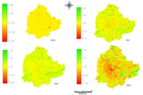
Figure 3: Land cover changes from 1973 – 2010
Land use analysis:
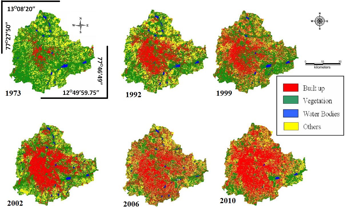
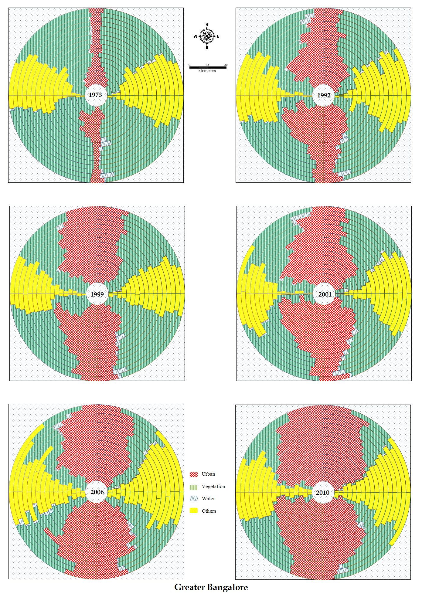
Land use analysis for the period 1973 to 2010 has been done using Gaussian maximum likelihood classifier and the temporal land use details are given in table 3. Figure 4 provides the land use in the region during the study period. Overall accuracy of the classification was 72% (1973), 77% (1992), 76% (1999), 80% (2002), 75% (2006) and 78% (2010) respectively. There has been a 584% growth in built-up area during the last four decades with the decline of vegetation by 66% and water bodies by 74%. Analyses of the temporal data reveals an increase in urban built up area of 342.83% (during 1973 to 1992), 129.56% (during 1992 to 1999), 106.7% (1999 to 2002), 114.51% (2002 to 2006) and 126.19% from 2006 to 2010. Figure 5 illustrates the zone-wise temporal land use changes at local levels. Table 4 lists kappa statistics and overall accuracy.
Table 3: Temporal Land use dynamics
| Class |
Urban |
Vegetation |
Water |
Others |
| Year |
Ha |
% |
Ha |
% |
Ha |
% |
Ha |
% |
| 1973 |
5448 |
7.97 |
46639 |
68.27 |
2324 |
3.40 |
13903 |
20.35 |
| 1992 |
18650 |
27.30 |
31579 |
46.22 |
1790 |
2.60 |
16303 |
23.86 |
| 1999 |
24163 |
35.37 |
31272 |
45.77 |
1542 |
2.26 |
11346 |
16.61 |
| 2002 |
25782 |
37.75 |
26453 |
38.72 |
1263 |
1.84 |
14825 |
21.69 |
| 2006 |
29535 |
43.23 |
19696 |
28.83 |
1073 |
1.57 |
18017 |
26.37 |
| 2010 |
37266 |
54.42 |
16031 |
23.41 |
617 |
0.90 |
14565 |
21.27 |
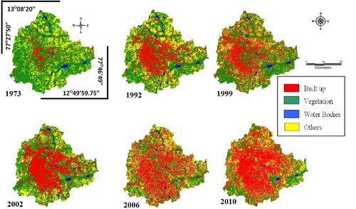
Figure 4: Land use changes in Greater Bangalore
Table 4: Kappa values and overall accuracy.
| Year |
Kappa coefficient |
Overall accuracy (%) |
| 1973 |
0.88 |
72 |
| 1992 |
0.63 |
77 |
| 1999 |
0.82 |
76 |
| 2002 |
0.77 |
80 |
| 2006 |
0.89 |
75 |
| 2010 |
0.74 |
78 |
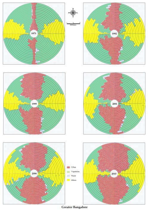
Figure 5: Zone-wise and Gradient-wise temporal land use
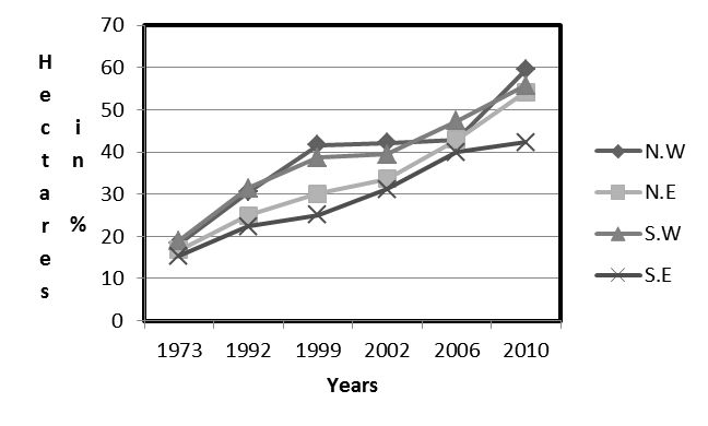
Urban density is computed for the period 1973 to 2010 and is depicted in Figure 6, which illustrates that there has been a linear growth in almost all directions (except NW direction, which show stagnation during 1999-2006). Developments in various fronts with the consequent increasing demand for housing have urbanized these regions evident from the drastic increase in the urban density during the last two decades. In order to understand the level of urbanisation and quantification at local level, each zone is further divided into concentric circles.
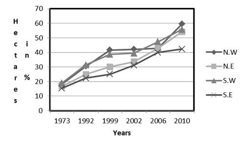
Figure 6: Built up density across years from 1973 to 2010
Density Gradient Analysis:
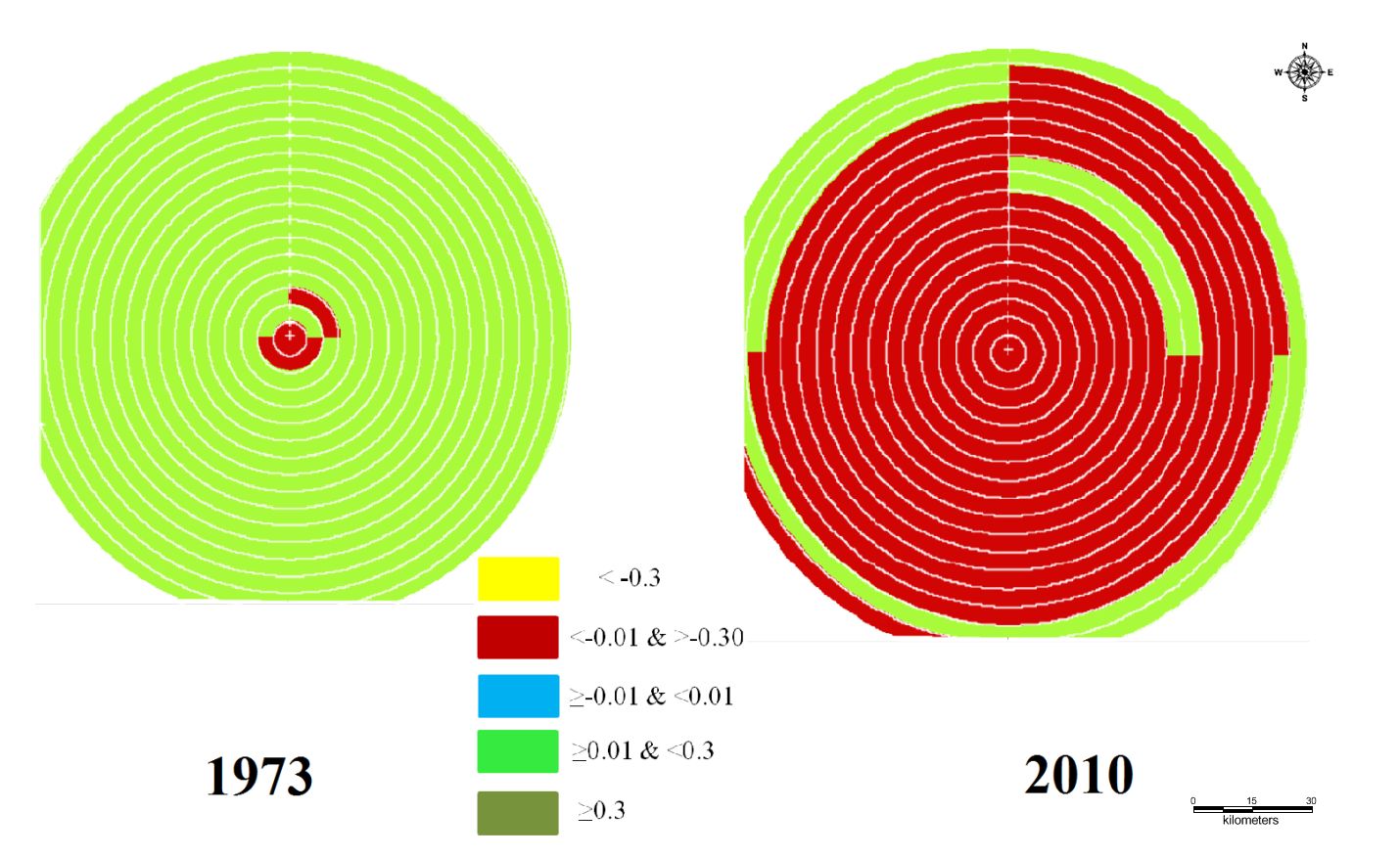
Study area was divided into concentric incrementing circles of 1 km radius (with respect to centroid or central business district) in each zone. The urban density gradient given in Figure 7 for the period 1973 to 2010, illustrates radial pattern of urbanization and concentrated closer to the central business district and the growth was minimal in 1973. Bangalore grew intensely in the NW and SW zones in 1992 due to the policy of industrialization consequent to the globalization. The industrial layouts came up in NW and housing colonies in SW and urban sprawl was noticed in others parts of the Bangalore. This phenomenon intensified due to impetus to IT and BT sectors in SE and NE during post 2000. Subsequent to this, relaxation of FAR (Floor area ratio) in mid-2005, lead to the spurt in residential sectors, paved way for large scale conversion of land leading to intense urbanisation in many localities. This also led to the compact growth at central core areas of Bangalore and sprawl at outskirts which are deprived of basic amenities. The analysis showed that Bangalore grew radially from 1973 to 2010 indicating that the urbanisation has intensified from the city centre and reached the periphery of Greater Bangalore. Gradients of NDVI given in Figure 8 further corroborate this trend. Shannon entropy, alpha and beta population densities were computed to understand the level of urbanization at local levels.
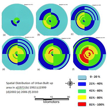
Figure 7: Gradient analysis of Greater Bangalore- Builtup density circlewise & zonewise.
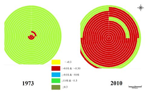
Figure 8: NDVI gradients - circlewise and zone wise
Calculation of Shannon’s Entropy, Alpha and Beta Densities:
Shannon entropy was calculated for the years 1973, 1992, 1999, 2002, 2006, 2010 listed in Table 5. The value of entropy ranges from zero to log (n). Lower entropy values indicate aggregated or compact development. Higher the value or closer to log (n) indicates the sprawl or dispersed or sparse development. Grater Bangalore grew and has almost reached the threshold of growth (log (n) = log (17) = 1.23) in all directions. Lower entropy values of 0.126 (SE), 0.173 (NE), 0.170 (SW) and 0.217 (NW) during 70’s show aggregated growth. However, the dispersed growth is noticed at outskirts in 90’s and post 2000’s (0.64 (SE), 0.771 (NE), 0.812 (NW) and 0.778 (SW)).
Table 5: Shannon Entropy.
| |
NE |
NW |
SE |
SW |
| 1973 |
0.173 |
0.217 |
0.126 |
0.179 |
| 1992 |
0.433 |
0.509 |
0.399 |
0.498 |
| 1999 |
0.504 |
0.658 |
0.435 |
0.607 |
| 2002 |
0.546 |
0.637 |
0.447 |
0.636 |
| 2006 |
0.65 |
0.649 |
0.610 |
0.695 |
| 2010 |
0.771 |
0.812 |
0.640 |
0.778 |
Shannon's entropy values of recent time confirm dispersed haphazard urban growth in the city, particularly in city outskirts. This also illustrates the extent of influence of drivers of urbanization in various directions. In order to understand this phenomenon, Alpha and Beta population densities were computed.
Table 6 lists alpha and beta densities zone-wise for each circle. These indices (both alpha and beta densities) indicate that there has been intense growth in the centre of the city and SE, SW and NE core central area has reached the threshold of urbanisation.
Table 6: Alpha and Beta density in each region – Zone wise, Circle wise
| Radius |
North East |
North West |
South East |
South West |
| |
Alpha |
Beta |
Alpha |
Beta |
Alpha |
Beta |
Alpha |
Beta |
| 1 |
1526.57 |
1385.38 |
704.71 |
496.05 |
3390.82 |
2437.32 |
3218.51 |
2196.83 |
| 2 |
333.99 |
288.58 |
371.00 |
280.41 |
983.51 |
857.04 |
851.23 |
555.33 |
| 3 |
527.99 |
399.83 |
612.02 |
353.50 |
904.02 |
701.47 |
469.19 |
369.67 |
| 4 |
446.99 |
343.51 |
360.72 |
286.39 |
602.14 |
441.66 |
308.47 |
262.52 |
| 5 |
152.43 |
122.74 |
255.11 |
226.72 |
323.07 |
243.02 |
236.56 |
188.26 |
| 6 |
123.16 |
94.91 |
370.22 |
324.12 |
306.48 |
203.54 |
58.57 |
51.12 |
| 7 |
73.65 |
57.96 |
254.49 |
207.29 |
54.77 |
32.64 |
77.07 |
73.09 |
| 8 |
38.16 |
27.80 |
71.54 |
62.38 |
57.22 |
30.52 |
61.85 |
57.29 |
| 9 |
44.99 |
29.54 |
92.73 |
69.97 |
51.74 |
26.00 |
37.60 |
31.90 |
| 10 |
48.43 |
25.22 |
93.51 |
55.75 |
33.31 |
17.44 |
25.99 |
16.61 |
| 11 |
50.32 |
23.77 |
100.55 |
56.56 |
22.69 |
11.63 |
35.90 |
18.75 |
| 12 |
42.34 |
17.92 |
67.36 |
34.36 |
27.12 |
11.29 |
25.52 |
10.86 |
| 13 |
59.87 |
22.20 |
40.87 |
17.71 |
30.66 |
9.44 |
35.59 |
11.92 |
| 14 |
54.10 |
18.38 |
24.51 |
9.91 |
24.16 |
5.35 |
19.77 |
5.49 |
| 15 |
60.81 |
20.73 |
21.48 |
8.98 |
19.52 |
3.50 |
26.41 |
6.56 |
| 16 |
62.17 |
23.79 |
46.81 |
12.83 |
16.92 |
2.96 |
66.19 |
17.35 |
| 17 |
16.54 |
24.76 |
53.30 |
14.58 |
16.45 |
2.02 |
41.40 |
10.36 |
Gradients of alpha and beta densities is given in Figure 9, illustrates urban intensification in the urban centre and sprawl is also evident NW and SW regions.
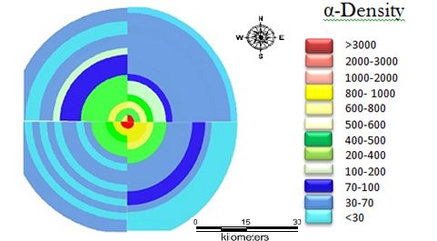
Figure 9: Alpha Density– zonewise for each local regions
Landscape Metrics: Landscape metrics were computed circle-wise for each zones. Percentage of Landscape (PLAND) indicates that the Greater Bangalore is increasingly urbanized as we move from the centre of the city towards the periphery. This parameter showed similar trends in all directions. It varied from 0.043 to 0.084 in NE during 1973. This has changed in 2010, and varies from 7.16 to 75.93. NW also shows a maximum value of 87.77 in 2010. Largest patch index indicate that the city landscape is fragmented in all direction during 1973 due to heterogeneous landscapes. However this has aggregated to a single patch in 2010, indicating homogenisation of landscape. The patch sizes were relatively small in all directions till 2002 with higher values in SW and NE. In 2006 and 2010, patches reached threshold in all directions except NW which showed a slower trend. Largest patches are in SW and NE direction (2010). The patch density was higher in 1973 in all directions due to heterogeneous land uses, which increased in 2002 and subsequently reduced in 2010, indicating the sprawl in early 2000’s and aggregation in 2010. PAFRAC had lower values (1.383) in 1973 and maximum of 1.684 (2010) which demonstrates circular patterns in the growth evident from the gradient. Lower edge density was in 1973, increased drastically to relatively higher value 2.5 (in 2010). Clumpiness index, Aggregation index, Interspersion and Juxtaposition Index highlights that the centre of the city is more compact in 2010 with more clumpiness in NW and SW directions. Area weighted Euclidean mean nearest neighbour distance is measure of patch context to quantify patch isolation. Higher v values in 1973 gradually decrease by 2002 in all directions and circles. This is similar to patch density dynamics and can be attributed to industrialization and consequent increase in the housing sector. Analyses confirm that the development of industrial zones and housing blocks in NW and SW in post 1990’s, in NE and SE during post 2000 are mainly due to policy decision of either setting up industries or boost to IT and BT sectors and consequent housing, infrastructure and transportation facilities. PCA was performed with 21 metrics computed zonewise for each circle. This helped in prioritising the metrics (Table 2) while removing redundant metrics for understanding the urbanization, which are discussed next.
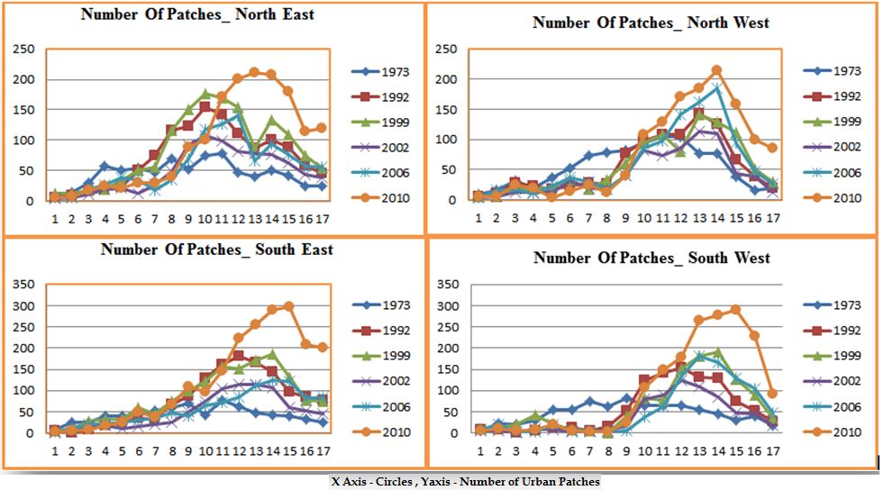
- Number of urban patches has steadily decreased in the inner core circles from 1973 to 2010, which indicates aggregation. A sharp increase in the urban patches in the periphery (outer rings) from 25 to 120 indicates of numerous smallurban patches pointing to the urban sprawl. Urban sprawl is thus effectively visualized by this index, evident with SW, SE and NE zones in Figure 10. The outer circle having on an average 120 urban patches compared to 5 in inner circles.
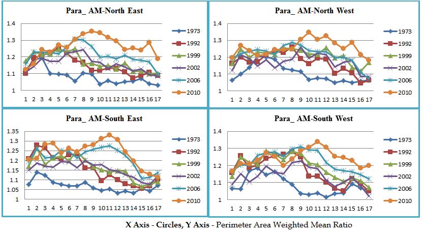
- Perimeter Area Weighted Mean Ratio (PAWMR) reflects the patch shape complexity and is given in Figure 11. The values closer to zero in the inner circles indicate the simple shape, whereas the outer circles show the increasing trends in all directions. This highlights an enhanced rate of anthropogenic interventions and hence the process of Sprawl.
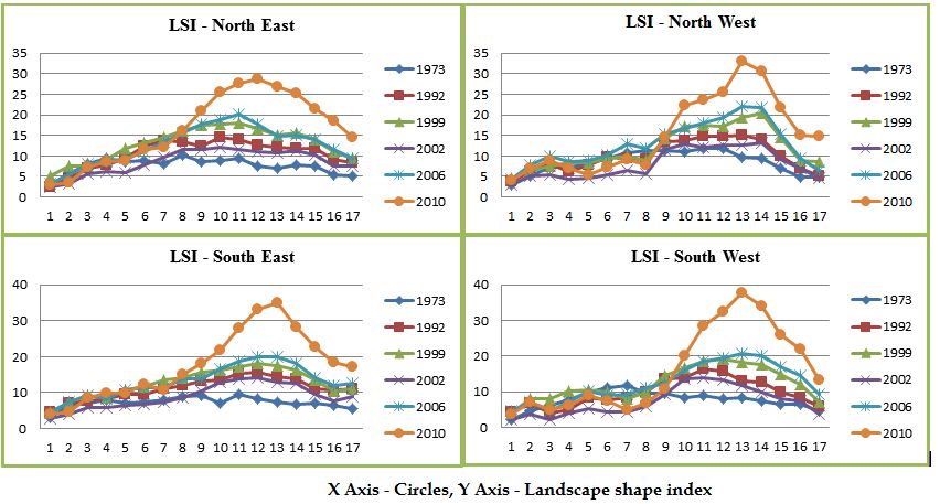
- Landscape shape index indicates the complexity of shape, close to zero indicates maximally compact (at city centre) and higher values in outer circles indicate disaggregated growth in 2010 (Figure 12). The trend of sprawl at city outskirts as well as at the centre was noticed till 1980’s. However, post 80’s values indicate of compactness at city centre, while outer rings show disaggregated growth.
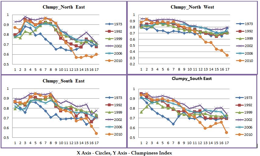
- Clumpiness index represents the similar trend of compact growth at the center of the city which gradually decreases towards outer rings indicating the urban agglomeration at centre and phenomena of sprawl at the outskirts in 2010 (Figure13). This phenomenon is very prominent in Northeast and Southwest direction.
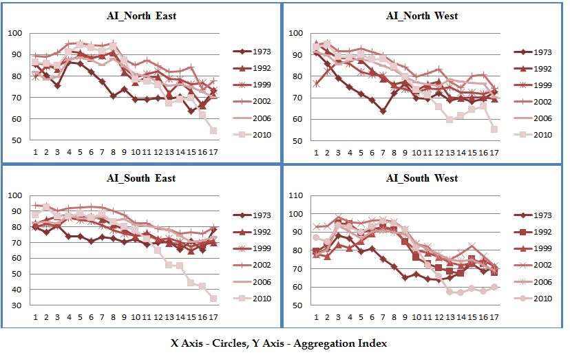
- Aggregation index indicated that the patches are maximally aggregated in 2010 while it was more dispersed in 1973, indicating that city is getting more and more compact (Figure 14).
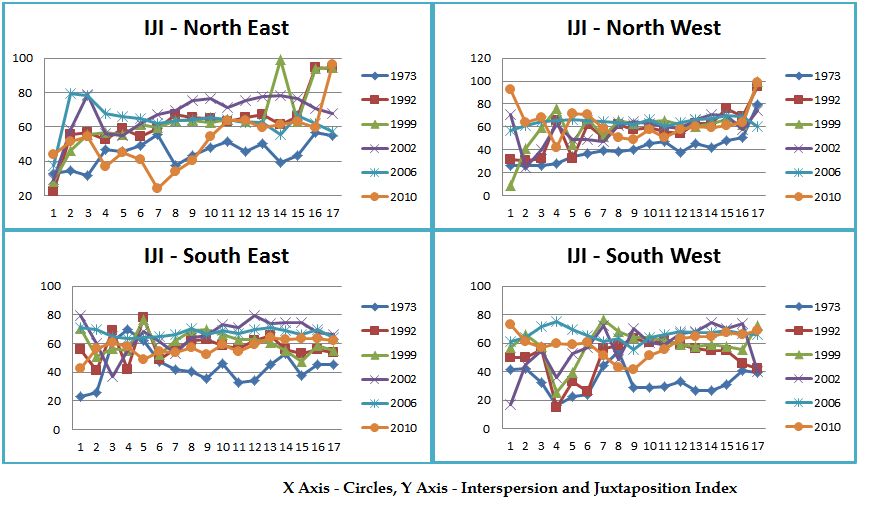
- Interspersion and Juxtaposition Index was very high as high as 94 in all directions which indicate that the urban area is becoming a single patch and a compact growth towards 2010 (Figure 15). All these metrics point towards compact growth in the region, due to intense urbanization. Concentrated growth in a region has telling influences on natural resources (disappearance of open spaces – parks and water bodies), traffic congestion, enhanced pollution levels and also changes in local climate (Ramachandra and Kumar 2009; 2010)
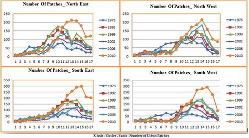
Figure 10: Number of Patches – Direction-wise/ Circle-wise.
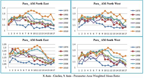
Figure 11: PARA_AM – Direction-wise/ Circle-wise.
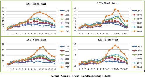
Figure 12: LSI – Direction-wise/ Circle-wise.
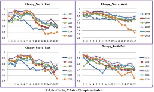
Figure 13: Clumpiness Index – Direction-wise/ Circle-wise.
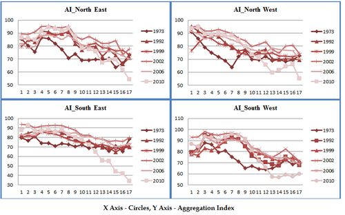
Figure 14: Aggregation Index – Direction-wise/ Circle-wise.
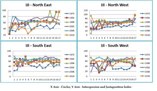
Figure 15: Interspersion and Juxtaposition – Direction-wise/ Circle-wise.
Note: X axis Represents Gradients taken from the center and y axis the metric value in Figures 10 to 15.
The discussion highlights that the development during 1992 to 2002 was phenomenal in NW, SW due to Industrial development (Rajajinagar Industrial estate, Peenya industrial estate etc.) and consequent spurt in housing colonies in the nearby localities. The urban growth picked up in NE and SE (Whitefield, Electronic city etc.) during post 2000 due to State’s encouraging policy to information technology and biotechnology sectors and also setting up International airport.
|