 |
1 Energy & Wetlands Research Group, Centre for Ecological Sciences, 2 Centre for Sustainable Technologies (astra), 3 Centre for infrastructure, Sustainable Transportation and Urban Planning [CiSTUP] Indian Institute of Science, Bangalore – 560 012, India E-mail: cestvr@ces.iisc.ac.in |
RESULTS AND DISCUSSION
1. Land use Classification
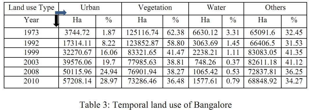
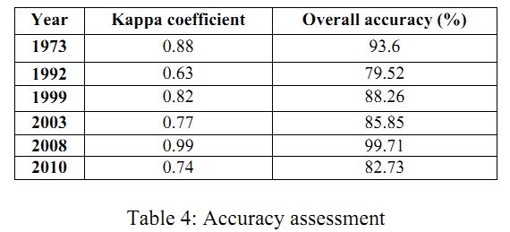
Temporal land use changes listed in Table 3 and Figure 4respectively illustrates the temporal dynamics during 1973 to 2010. This highlights that the percentage of urban land is increasing in all directions due to the policy decisions of (i) industrialization (ii) boost to information technology and biotechnology sector in late 90’s and consequent housing developments in the periphery. The urban growth is concentrated or clumpedat the center, while the sprawl or dispersed growth is observed in the periphery. Table 4 illustrates the accuracy assessment for the supervised classified images.
As shown in the table 3 the percentage of urban has increased from 1.87(year 1973) to 28.47% (year 2010) where as the vegetation has decreased from 62.38to 36.48%.
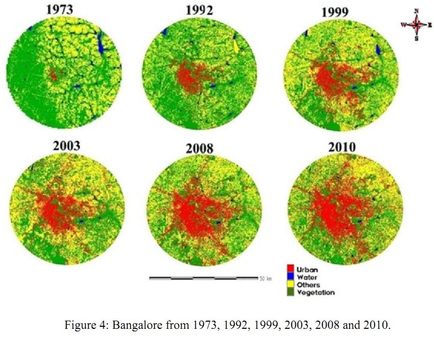
Figure 4: Bangalore from 1973, 1992, 1999, 2003, 2008 and 2010
Table 3: Temporal land use of Bangalore
| Land use Type | Urban | Vegetation | Water | Others | ||||
| Year | Ha | % | Ha | % | Ha | % | Ha | % |
| 1973 | 3744.72 | 1.87 | 125116.74 | 62.38 | 6630.12 | 3.31 | 65091.6 | 32.45 |
| 1992 | 17314.11 | 8.22 | 123852.87 | 58.80 | 3063.69 | 1.45 | 66406.5 | 31.53 |
| 1999 | 32270.67 | 16.06 | 83321.65 | 41.47 | 2238.21 | 1.11 | 83083.05 | 41.35 |
| 2003 | 39576.06 | 19.7 | 77985.63 | 38.81 | 748.26 | 0.37 | 82611.18 | 41.12 |
| 2008 | 50115.96 | 24.94 | 76901.94 | 38.27 | 1065.42 | 0.53 | 72837.81 | 36.25 |
| 2010 | 57208.14 | 28.97 | 73286.46 | 36.48 | 1577.61 | 0.79 | 68848.92 | 34.27 |
Table 4: Accuracy assessment
| Year | Kappa coefficient | Overall accuracy (%) |
| 1973 | 0.88 | 93.6 |
| 1992 | 0.63 | 79.52 |
| 1999 | 0.82 | 88.26 |
| 2003 | 0.77 | 85.85 |
| 2008 | 0.99 | 99.71 |
| 2010 | 0.74 | 82.73 |
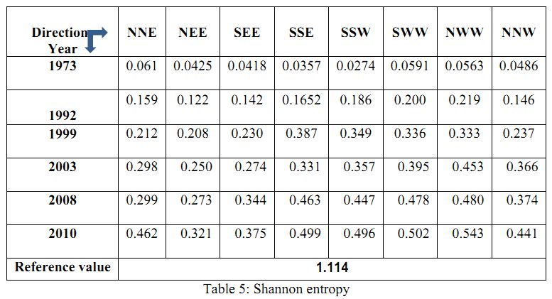
2. Shannon’s entropy
The entropy is calculated with respect to 13 circles in 4 directions. The reference value is taken as Log (n) where n=13, which is 1.114. Larger value of entropy (near to upper limit) reveals the occurrence and spatial distribution of the urban sprawl. The entropy values (table 5) show the increasing trend during 1973 to 2010 indicating the sprawl or higher degree of dispersion of built-up area in the city with respect to 4 directions and aremost prominent in SWW & NWW directions.
Table 5: Shannon entropy
| Directions Year |
NNE | NEE | SEE | SSE | SSW | SWW | NWW | NNW |
| 1973 | 0.061 | 0.0425 | 0.0418 | 0.0357 | 0.0274 | 0.0591 | 0.0563 | 0.0486 |
| 1992 | 0.159 | 0.122 | 0.142 | 0.1652 | 0.186 | 0.200 | 0.219 | 0.146 |
| 1999 | 0.212 | 0.208 | 0.230 | 0.387 | 0.349 | 0.336 | 0.333 | 0.237 |
| 2003 | 0.298 | 0.250 | 0.274 | 0.331 | 0.357 | 0.395 | 0.453 | 0.366 |
| 2008 | 0.299 | 0.273 | 0.344 | 0.463 | 0.447 | 0.478 | 0.480 | 0.374 |
| 2010 | 0.462 | 0.321 | 0.375 | 0.499 | 0.496 | 0.502 | 0.543 | 0.441 |
| Reference value | 1.114 | |||||||
3. Landscape metrics Analysis
The entropy values show the urbanization is reaching critical value in all the directions. To understand the driving forces of urban growth, landscape metrics are computed circlewise for each direction. Table 2 describes the spatial metrics computed at the landscape level explain relatively general information of entire landscape (unit) under investigation. Metrics computed at the class level are helpful for understanding of landscape development per particular class. The analysis of landscape metrics provided an overall summary of landscape composition and configuration.
Figure 5 and Figure 6 shows the built-up area and built-up percentage, for the year 1973 both the indices had higher values in the inner circles (1,2,3,and 4) which indicates of concentrated growth in the centre with higher values for SWW and NWW Regions. Towards 2010 there was intense growth in all zones of the city in all circles inside the boundary and less intense near the boundary and in 10km buffer. To understand the process of urbanisation it is necessary to know the kind of growth the particular direction is having and its intensity. Hence the patch index such as largest patch which tells us if there is aggregation or fragmented growth was computed.
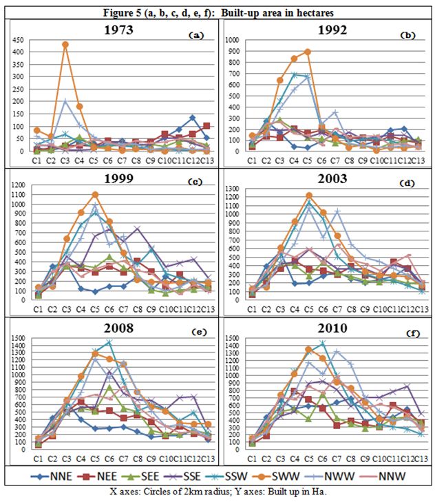
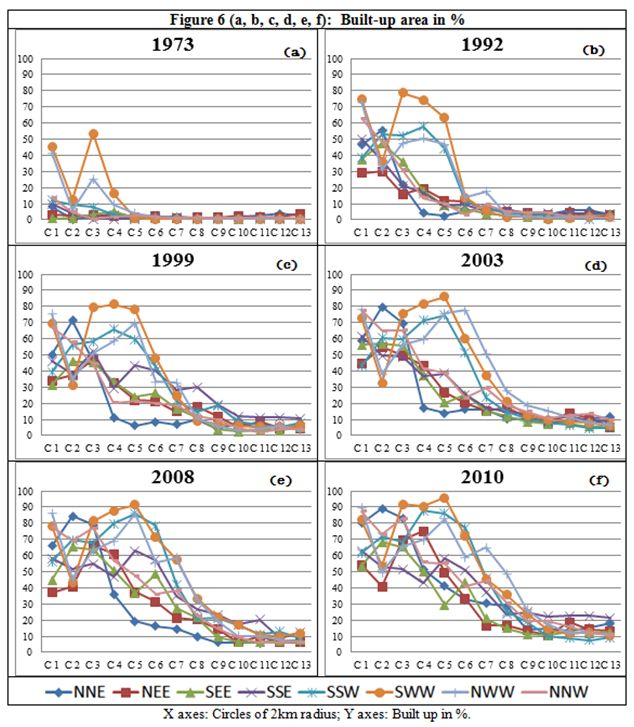
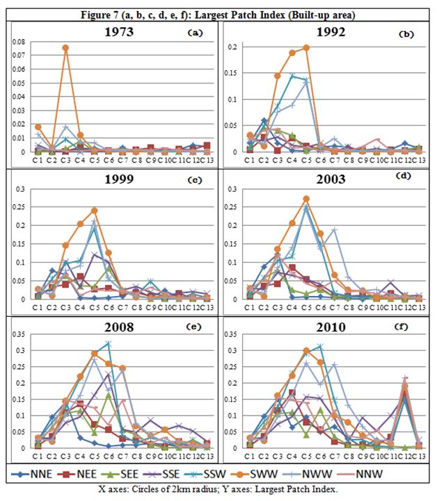
Figure 7 shows largest patch index with respect to built-up (i.e. class). In 1973 largest built-up patch existed in circle-3 of SWW direction (a single patch), whereas as the transition from 1973 to 2010, show the increase in patches and the large patches were found in circle 4 to circle 10 and few large patches near the 10km buffer.
Patches were retrieved, but to analyse the patch its size needs to be known with respect to other patches. To analyse this dimension mean patch size was computed. Figure 8shows MPS (mean patch size) with respect to built-up a measure of patch characteristics. MPS was higher near the periphery in 1973 as these were one single homogeneous patch as indicated above. Whereas the in 2010 the MPS showed higher value near the center where urban patches were prominent and were less near periphery which indicated of Fragmented growth. Figure 9 shows number of patches (NP) index with respect to built-up from 1973 to 2010, in the year 1973 NP are very less and in the year 2010 NP showing higher value means the city is more fragmented towards periphery and patches in the outer circles increases which means there is a fragmented growth which can be attributed to sprawl.
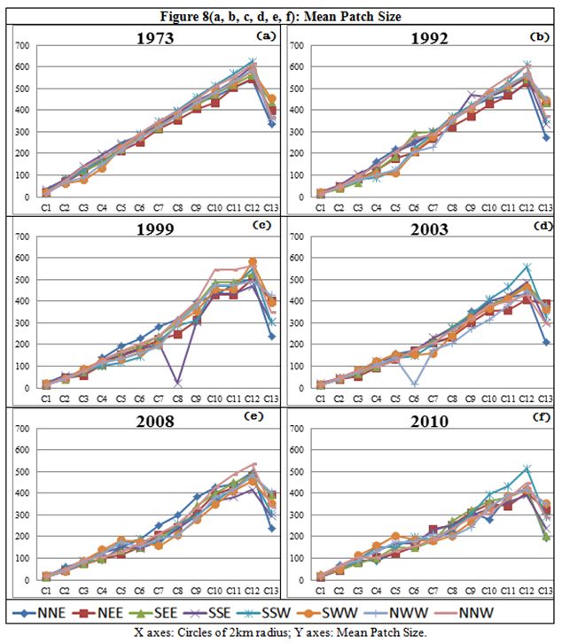
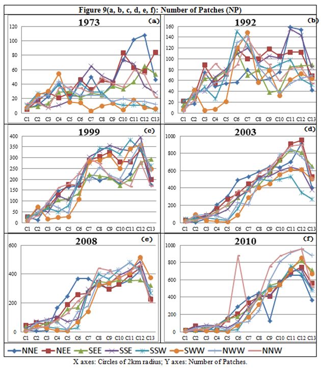
Figure 10 shows patch density (PD) index with respect to built-up. In the year 1973 PD is less because NP are very less and in the year 2010 PD is high with higher value of NP, which indicates of fragmented landscapes towards periphery.
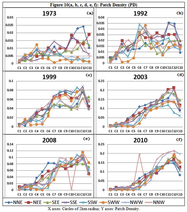
Figure 11 and Figure 12 shows MSI (Mean Shape Index) & NLSI (Normalized Landscape Shape Index) explain shape complexity. In the year 1973 shape complexity in all directions is simple. But the shape complexity increases as we move on 1973 to 2010.
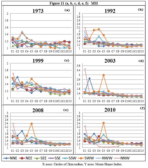
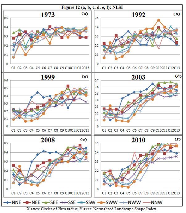
Figure 13 and Figure 14 shows Clumpy Indexand AI (Aggregation Index). The city is more clumped/aggregated in the center with respect to all the directions (i.e. aggregation) but towards periphery it is showing the patches are disaggregated for all the years indicating that the regions towards periphery in experiencing a kind of growth in which small fragments are formed and then each fragments join to form a single fragment (many to one) this clearly indicates urban sprawl happening in this region.
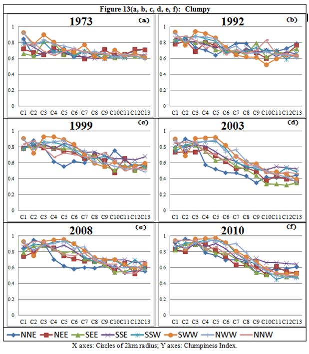
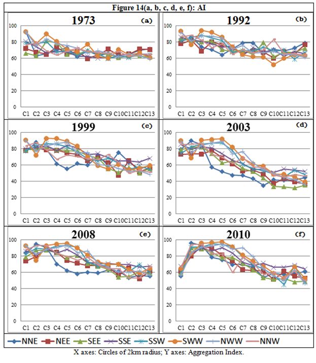
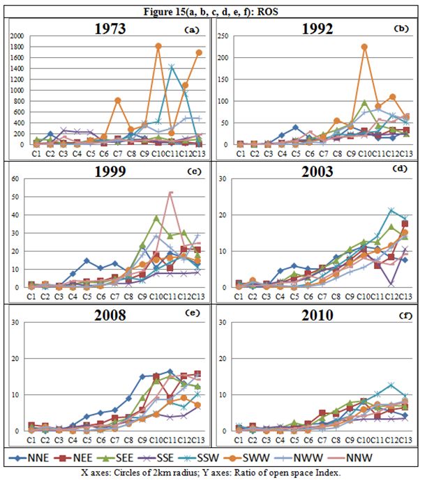
Figure 15 shows Ratio of Open Space (ROS) index. This Index explains the contribution of open spaces in urban region, which is necessary to understand the growth of urban region and its connected dynamics. ROS was more in 1973 with respect to all the directions, especially in the periphery of 10km boundary. ROS decreases in the later years and reaches low values in 2010 indicating that the urban patch dominates the open area which causes limits spaces and congestion in the urban area
| * Corresponding Author : | |
| Dr. T.V. Ramachandra Energy & Wetlands Research Group, Centre for Ecological Sciences, Indian Institute of Science, Bangalore – 560 012, INDIA. Tel : 91-80-23600985 / 22932506 / 22933099, Fax : 91-80-23601428 / 23600085 / 23600683 [CES-TVR] E-mail : cestvr@ces.iisc.ac.in, energy@ces.iisc.ac.in, Web : http://wgbis.ces.iisc.ac.in/energy |