|
Result and Discussion
5.1. Land Cover Analysis
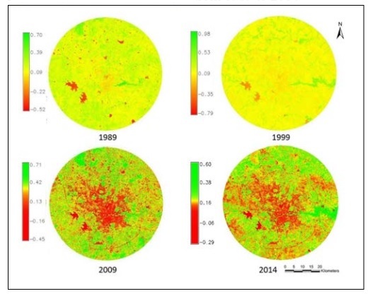
Temporal vegetation cover analysis was done through NDVI. Figure 3 indicates the land cover changes in the year 1989, 1999, 2009 and 2014. Clear indication of vegetation declination can be seen from 95.64% in 1989 to 61.15% in 2014, whereas the non- vegetation i.e. built up, paved areas etc. have increased 4.36% in 1989 to 38.85% in 2014. To understand the land use categories like built up areas and nonvegetation areas clearly, land use analysis was performed.

Fig. 3 Vegetation cover changes from 1989 to 2014
| Year |
Vegetation (%) |
Non-Vegetation (%) |
| 1989 |
95.64 |
4.36 |
| 1999 |
93.28 |
6.72 |
| 2009 |
82.67 |
17.4 |
| 2014 |
61.15 |
38.85 |
Table 5. Land cover changes 1989-2014
5.2. Land Use Analysis
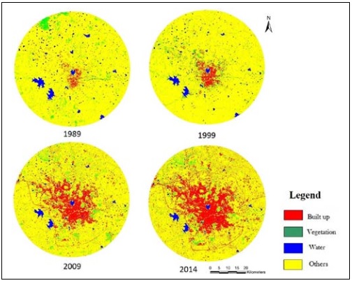
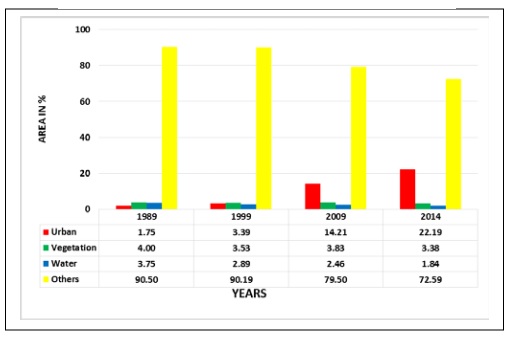
GMLC supervised classification technique was employed to perform land use analysis by considering four major categories. Figure 4 represents land use dynamics for Hyderabad region in past 4 decades with significant changes in all categories. An alarming increase in built up areas were observed. Land use statistics is as tabulated in table 6. Overall accuracy obtained for the classification ranged from 87% to 94%. Both overall accuracy and kappa statistics are listed in table 7.

Fig. 4 Land use dynamics from 1989 to 2014
| Year |
Overall Accuracy (%) |
Kappa |
| 1989 |
94 |
0.73 |
| 1999 |
87 |
0.85 |
| 2009 |
90 |
0.90 |
| 2014 |
91 |
0.76 |
Table 7. Overall accuracy and kappa statistics
5.3. Landscape Metrics
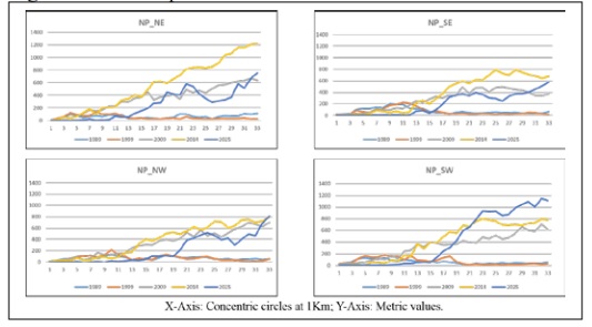
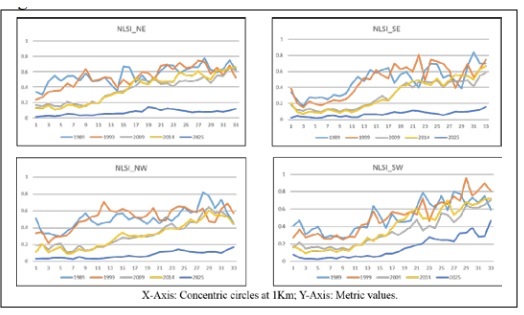
Landscape metrics were calculated for each zone and gradient study region. Number of Patches (NP) indicates count of urban or built up patches. Figure 5 shows patches have increased in all periods of time but year 2009 and 2014 shows rapid growth in all the directions pointing out fragmentation in these years appear to be more. It is to be observed that in 2014, core city area (circles 1-11), each patch has agglomerated into a single large urban patch i.e. there is a saturated urban landscape with no other landscape type. Normalized landscape shape index provides measure of class aggregation. All four zones shows lesser value of NLSI in 2014 compared to 1989 as seen in figure 6. These minimum values (NLSI < 0.5) points out that the landscape consists of a single square urban patch or it is maximally compact (i.e., almost square) in contrast with the higher values in 1999 (NLSI ≈ 1) specifying that the urban patches are disaggregated maximally with complex shapes.

Fig. 5 Number of patches – Direction and circle wise

Table 6 Category wise changes in land cover

Fig. 6 NLSI – Direction and circle wise
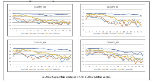
Clumpiness deals with aggregation and disaggregation for adjacent urban patches. Referring to figure 7, 1989 the values closer to 0 (circles 23-31, in NE, SE, SW directions) indicates less compact growth or maximum disaggregation. In 2014 curve shows values approaching +1 in all directions, especially in core city areas (circles 1-15) which means to say that the growth is very complex and all the patches are maximally aggregated to form large urban monotype patch.

Fig. 7 Clumpiness – Direction and circle wise
Citation : Chandan M C, Bharath H Aithal, Ramachandra T V, 2017, Integrated approach to visualize urban growth: case study of rapidly urbanising city. International Symposium on Water Urbanism and Infrastructure Development in Eco-Sensitive Zones 6-7 January 2017 Kolkata, India.
| * Corresponding Author : |
|
Chandan M C
Research Scholar
Ranbir and Chitra Gupta School of Infrastructure Design and Management, IIT Kharagpur, West Bengal 721302 India
E-mail : chandan.gisnitk@gmail.com |
|
