|
Landscape Modelling for Sustainable Urban Management
|
PDF Home |
| Home Abstract Introduction Methods Study area Results Conclusion Acknowledgement References | |
 |
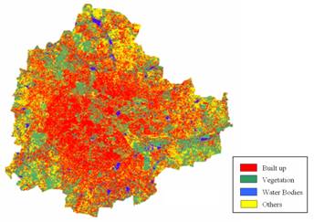
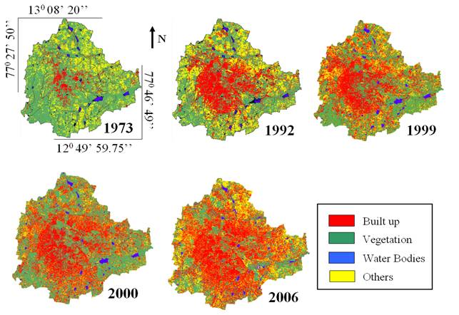
4. Results and discussions 4.1 Classification of IRS LISS-III (2006) data : IRS LISS-III (Indian Remote Sensing Satellite Linear Imaging Self Scanner-III) data acquired on 28th March, 2006 (procured from NRSA, Hyderabad, India) having 3 spectral bands (Green, Red and NIR) with 23.5 m spatial resolution were georegistered with known ground control points (GCPs) and geometrically corrected and resampled to 25 m (1360 x 1400 pixels) which helped in pixel level comparison of abundance maps obtained by unmixing MODIS data (of 2006) with LISS-III classified map. The class spectral characteristics for four LC categories (buildings/urban, vegetation, water bodies and others) using LISS-III MSS bands 2, 3 and 4 were obtained from the training pixels spectra to assess their inter-class separability and the images were classified using Gaussian Maximum Likelihood classifier with training data uniformly distributed over the study area collected with pre calibrated GPS (figure 5). This was validated with the representative field data (training sets collected covering the entire city and validation covering ~ 10% of the study area) and also using Google Earth image (http://www.earth.google.com). LC statistics, producer’s accuracy, user’s accuracy and overall accuracy computed are listed in table 3. The urban pixels were extracted from the classified image and were used as a benchmark to validate the output obtained from OSP.
Table 3 : LC details using LISS -III MSS
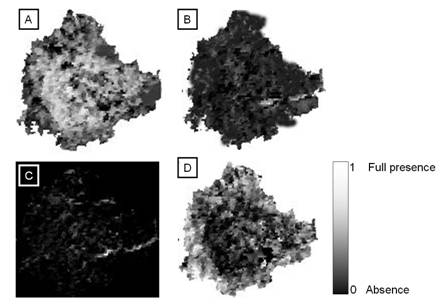
4.2 Unmixing of MODIS data using OSP : MODIS data (of 2006) having 7 bands with band 1 and 2 at 250 m and band 3 to 7 at 500 m spatial resolution were georegistered with GCPs, geometrically corrected and bands 3 to 7 were resampled to 250 m (136 x 140 pixels) so that all 7 bands are at same spatial resolution. Unmixing of MODIS data (250 m) were done to obtain abundance map of the impervious surface. Visual inspection as well as accuracy assessment of abundance image showed that OSP algorithm maps impervious surface spatially and proportionally similar to supervised classified image of LISS-III (of 2006). The proportions of urban pixels in the image (figure 6) range from 0 to 1, with 0 indicating absence and increasing value showing higher abundance.
Table 4 : Percent Impervious surface from abundance map
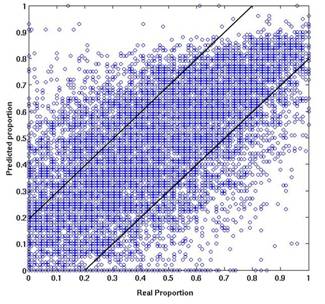
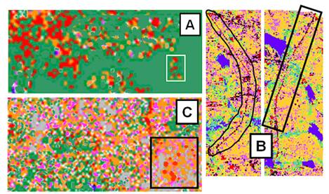
4.3 Accuracy assessment at pixel level : A pixel of MODIS (250 m) corresponds to a kernel of 10 x 10 pixels of LISS-III spatially. The builtup abundance map was validated pixel by pixel with the LISS-III builtup map. The proportion of builtup percentage obtained in these 136 x 140 cells were compared using three measures of performance – Root Mean Square (RMS) errors (0.160), Bivariate Distribution Functions (BDFs) between LISS-III classified (real proportion) and MODIS based abundance map (predicted proportions) and Wilcoxon signed rank test. The bivariate plot (figure 7) was helpful to visualise the accuracy of prediction by mixture models. While most of the points fall between the two 20% difference lines, some points are outside the lines indicating that there could be higher or lower estimation than the actual values. The Pearson's product-moment correlation was 0.84 (p-value < 2.2e-16). 10% of the difference pixels between the LISS-III proportion and the MODIS abundance were randomly selected at the same spatial locations in the two images by random number generation. These difference data values failed when subjected to normality test (table 5). Table 5 : Normality tests for the difference in LISS-III and MODIS proportions
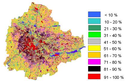
The data points corresponding to builtup proportion in a MODIS pixel and corresponding LISS-III pixels were then subjected to box-plot and histogram analysis. The distribution was symmetrical and hence Wilcoxon signed rank test with continuity correction was performed (p-value = 0.6633), which showed less evidence against null hypothesis – true location of the median of the difference between two data sets is equal to 0. The abundance image were further analysed with a minimum detectable threshold of 10 percent and in increments of 10 percent (i.e., 20 to 30%, 30-40%, …., 90 to 100%) as shown in figure 8. Objects representing different brightness classes of impervious surface are typically selected to be mapped based on the tonal variations in the builtup landscape, which constitute spectral classes. The results hold great promise for improved accessibility and accuracy of this important urban indictor at the local and city level.
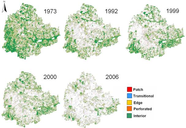
4.4 Forest fragmentation Model : Supervised classification was performed on temporal datasets for Bangalore city using Bayesian classifier using the open source programs (i.gensig, i.class and i.maxlik) of Geographic Resources Analysis Support System (http://wgbis.ces.iisc.ac.in/grass) as displayed in figure 9. Accuracy assessment was done using field knowledge, and visual interpretation which showed an overall accuracy of 72 %, 75 %, 71 %, 77 % 85 % and 55 % for the year 1973, 1992, 1999, 2000, 2006 and 2007. The class statistics is given in table 6. Table 6 : Greater Bangalore land cover statistics
From the classified raster data, urban class was extracted and converted to vector representation for computation of precise area in hectares indicating 466 % increase in built up area from 1973 to 2007 as evident from temporal analysis leading to a sharp decline of 61% area in water bodies mostly attributing to intense urbanisation process. The rapid development of urban sprawl has many potentially detrimental effects including the loss of valuable agricultural and eco-sensitive (e.g. wetlands, forests) lands, enhanced energy consumption and greenhouse gas emissions from increasing private vehicle use. Vegetation has decreased by 63 % from 1973 to 2007. Using the results from classification, forest fragmentation model was used to obtain fragmentation indices as shown in figure 10 and the statistics are presented in table 7.
Table 7 : Forest fragmentation types details
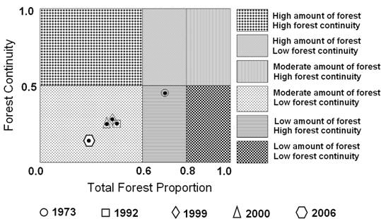
Applying forest fragmentation model to a time series LC data provided a quantitative assessment of the pattern of forest fragmentation at each date and a means for tracking trends in forest fragmentation. Patch forest which was only 2.45 % in 1973 image has increased up to 9.6 % in 2006 and interior forest has decreased from 54 % in 1972 to 27.7 % in 2006. Using the results from the forest fragmentation model, further the state of the fragmentation the city was developed. While the forest fragmentation map produced valuable information, it was difficult to visualise the state of forest fragmentation for tracking the trends and to identify the areas where forest restoration might prove appropriate to reduce the impact of forest fragmentation. The values of TFP and FC calculated (table 8) for the temporal data were plotted on a graph that specifies six conditions of forest fragmentation in figure 11. Table 8 : Total forest proportion and forest continuity
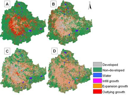
The TFP designations were determined based on the results of both Vogelmann, (1995) and Wickham (1999). They found that forest fragmentation become more severe as forest cover decreases from 100 percent cover towards 80 percent. Between 60 and 80 percent forest cover, the opportunity for re-introduction of forest to connect forest patches is greatest, and below 60 percent, forest patches become small and more fragmented. The FC regions were evenly split and designated high forest continuity (above 0.5) or low forest continuity (below 0.5). The amount of forest and continuity were high in 1973 and decreased substantially in 2006 (figure 11). Forest edges and perforations have less meaning where the amount of forest is low and percolation theory (Stauffer, 1985) identifies two critical values of Pf. In a completely forested landscape, for a completely random forest conversion on an infinite grid (and evaluating adjacency in cardinal directions), the residual forest is guaranteed to occur in identifiable patches when Pf falls below a critical value of about 0.4. Below that value, the nonforest pixels form a continuous path across the window. Conversely, as long as the residual forest is above a critical value of about 0.6, the forest pixels form such a path, and forest edges and perforations have more meaning. These values are used to define patch and transitional categories recognizing that they are approximate because actual LC pattern is not random. Forest fragmentation also depends on the scale of analysis (window size) and various consequences of increasing the window size are reported in Ritters et al., (2000). The measurements are also sensitive to pixel size. Nepstad et al., (1999a, 1999b) reported higher fragmentation when using finer grain maps over a fixed extent (window size) of tropical rain forest. Finer grain maps identify more nonforest area where forest cover is dominant but not exclusive. The strict criterion for interior forest is more difficult to satisfy over larger areas. Although knowledge of the feasible parameter space is not critical, there are geometric constraints (O’Neill, 1996). For example, it is not possible to obtain a low value of Pff when Pf is large. Percolation theory applies strictly to maps resulting from random processes; hence, the critical values of Pf (0.4 and 0.6) are only approximate and may vary with actual pattern. As a practical matter, when Pf > 0.6, nonforest types generally appeared as “islands” on a forest background, and when Pf < 0.4, forests appeared as “islands” on a nonforest background.4.5 Urban Growth Characterisation : Input data consisted of multi date images having three classes: urban, non-urban, and water bodies obtained from the supervised classification algorithm. Each single date fragmentation map consisted of three fragmentation classes – interior, perforated and patch. The final step in the urban growth model was to use two date fragmented image to create change map (1973 to 1992, 1992 to 1999, 1999 to 2000 and 2000 to 2006). The model produced urban growth maps, which consisted of developed land, non-developed land, water and the three types of growth (Infill growth, Expansion and Outlying growth) as shown in figure 12 and statistics are given in table 9.
Table 9 : Changes in Urban growth types from 1973 to 2006.
Outlying growth have been further classified as – isolated, linear branching and clustered growth (figure 13). There were no perfect linear growth (linear branching surrounded by non-developed land). In all the cases, linear branching was surrounded by one of the other growth classes such as expansion growth, infill growth etc.
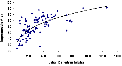
Combining several temporal urban growth maps creates an informative picture of the urban dynamics. Ward wise, impermeable areas were plotted against the urban population density to understand the increase in population density with the increase in the impermeable area (figure 14) and the probable relationship is given by equation 15. y = 11.36x0.295 (r =0.70) (15)
|
 |
|||||||||||||||||||||||||||||||||||||||||||||||||||||||||||||||||||||||||||||||||||||||||||||||||||||||||||||||||||||||||||||||||||||||||||||||||||||||||||||||||||||||||||||||||||||||||||||||||||||||||||||||||||||||||||||||||||||||||||||||||||||||||||||||||||||||||||||||||||||||||||||||||||||||||||||||||||||||||||||||||||||||||||
|
E-mail | Sahyadri | ENVIS | Energy | GRASS | CES | IISc | E-mail |
|||||||||||||||||||||||||||||||||||||||||||||||||||||||||||||||||||||||||||||||||||||||||||||||||||||||||||||||||||||||||||||||||||||||||||||||||||||||||||||||||||||||||||||||||||||||||||||||||||||||||||||||||||||||||||||||||||||||||||||||||||||||||||||||||||||||||||||||||||||||||||||||||||||||||||||||||||||||||||||||||||||||||||||