7.1 STUDY AREA 1: THE BANGALORE - MYSORE HIGHWAY
7.1.1. Image Analyses
The built-up
area for 1972 was extracted from the digitised toposheets and is shown in Figure
5. The villagewise built-up area was computed by overlaying the layer with village
boundaries (taluk map with village boundaries) and added to the attribute database
for further analyses.
LISS III sensor
data obtained from the NRSA in three bands, viz., Band 2 (green), Band 3 (red)
and Band 4 (near infrared), were used to create a False Colour Composite (FCC).
Training polygons (with their co-ordinates) were chosen from the composite image
and corresponding attribute data was obtained in the field for these polygons
(using GPS). Based on these signatures, corresponding to various land features,
image classification was done using Guassian Maximum Likelihood Classifier.
From the original classification of land-use of 16 categories the image was
reclassified to four broader categories as vegetation, water bodies, open land,
and built-up. The built-up theme identified from the image is shown in Figure
6.
From the classified
image the area under the built-up theme was computed. Area under villagewise
built-up theme in the study area was also computed by overlaying a vector layer
with village boundaries and tabulated accordingly for further analyses.
The built-up
area computed for temporal data indicated that there was 194% increase in the
built-up area from the seventies to late nineties. A more detailed investigation
of the distribution of the built-up (Table 2) revealed that the change is higher
as the proximity to Bangalore increases. The Bangalore North - South segment had
the highest increase in built-up area while it was least in Srirangapatna -
Mysore segment with 128%. It can also be observed that there is a declining
trend in the change in built-up area as one moves from Bangalore towards Mysore.
Table
2: Built-up Area and Shannon's Entropy for the Study Area
|
Segment |
Built-up
Area (sq. km) |
Percentage
Change in Built-up Area |
Shannon's
Entropy |
loge
n |
|||
|
1972 |
1998 |
1972 |
1998 |
|
|||
|
Bangalore
– Mysore |
8.2679 |
24.3344 |
194% |
2.658 |
2.556 |
4.477 |
|
|
|
|
|
|
|
|
|
|
|
Bangalore
– Ramanagaram |
0.7494 |
3.2232 |
330% |
2.69 |
2.699 |
3.5835 |
|
|
Channapatna
– Mysore |
7.5185 |
21.1112 |
181% |
2.320 |
2.083 |
3.9512 |
|
|
|
|
|
|
|
|
|
|
|
Bangalore
North – South |
0.1296 |
0.8538 |
559% |
2.427 |
2.338 |
2.565 |
|
|
Ramanagaram
– Channapatna |
0.9682 |
3.2777 |
239% |
2.717 |
2.592 |
3.401 |
|
|
Mandya
– Maddur |
5.9324 |
17.3804 |
193% |
1.662 |
1.434 |
3.434 |
|
|
Srirangapatna
– Mysore |
1.2377 |
2.8226 |
128% |
1.803 |
1.922 |
2.639 |
|
|
|
|
|
|
|
|
|
|
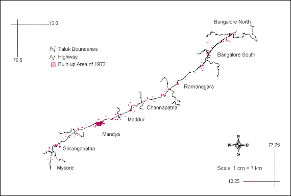
Figure 5: Built-up area in the Bangalore - Mysore segment in 1972
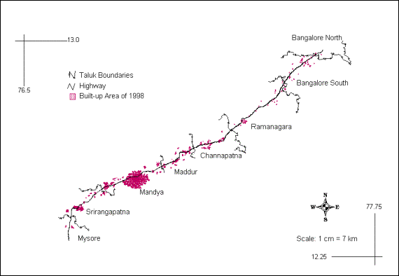
Figure 6: Built-up area in the Bangalore - Mysore segment in 1998
i. Shannon's Entropy
Shannon's
entropy was computed for villagewise built-up area, wherein each village was
considered as an individual zone (n = total number of villages). This revealed
that the distribution of built-up in the region in 1972 was slightly dispersed
than in 1999. However, the degree of dispersion has come down marginally and
that distribution is less dispersed or there is the less presence of sprawl when
the entire stretch is considered. The values obtained ranges from 2.658 (in
1972) to 2.556 (in 1998) and log n for this region is 4.477. These are higher
than the half way mark of log n (that is 2.238) and show some degree of
dispersion of built-up in the region. This non-uniform dispersed growth along
the road connecting Bangalore and Mysore necessitated further detailed
investigations for identifying the pockets of higher growth.
Detailed
investigation on the phenomenon was done in the next phase by dividing the study
area in to segments / zones. The entire segment of Bangalore - Mysore was split
in to two as Bangalore - Ramanagaram and Channapatna - Mysore segments. The
percentage built-up change and entropy was calculated for these two segments.
The Bangalore - Ramanagaram segment had a higher value of percentage built-up
change (330%) than the Channapatna - Mysore segment (181%). The entropy values
for the Bangalore - Ramanagaram segment ranges from 2.690 (for 1972) to 2.699
(for 1998) while log n for this region is 3.583 suggesting a similar trend. In
the Channapatna - Mysore segment the entropy value ranged from 2.320 (for 1972)
to 2.083 (for 1998) and log n is 3.951. This analysis reveals that the
distribution is more dispersed in Bangalore - Ramanagaram segment compared to
the later.
On further
division of the two segments into four to identify where the actual sprawl is
occurring, segments such as, Bangalore North - South, Ramanagaram - Channapatna,
Maddur - Mandya and Srirangapatna - Mysore were obtained. The results of these
(Table 2) clearly indicated that there was more dispersed distribution of
built-up in the region closer to Bangalore and this decreased as the proximity
to the city increased. The Bangalore North – South taluks had the highest
increase in terms of the percentage built-up change and the entropy values also
showed that there was more dispersion in this taluk, thus indicating higher
sprawl in this region. Higher sprawl due to the proximity of Bangalore is
observed till Channapatna - Ramanagaram segment and declines towards Mandya. It
also infers that in the Mandya - Maddur segment the distribution was slightly
compact with radial sprawl. But in the Srirangapatna - Mysore segment the value
of entropy showed marginal change in entropy. Here, the degree of sprawl is not
as severe as that in case of other segments, but the marginal increase in
entropy value certainly indicates the possibility of increasing sprawl due to
enhanced economic activities at Mysore.
With the results
of the Shannon's entropy indicating that regions nearer to Bangalore city had
more degree of sprawl, it was decided to work out and understand the patterns
of growth in the regions surrounding Bangalore city, in all directions. It was
seen that Bangalore was sprawling in radial direction from the city centre and
linear growth was noticed along all five major roads connecting the city - spreading
as five arms stretched outwards (Figure 7). The space between the arms or the
major roads acts as the sinks for city development. Further, it is seen that
the development occurred around the ring roads that connected these major roads.
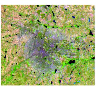
Figure 7: FCC of Bangalore city showing radial pattern of growth from the city centre and linear pattern along the highways
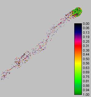
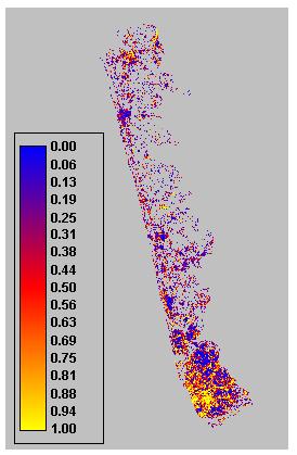
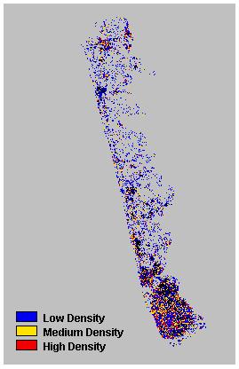
Map density
values are computed by dividing number of built up pixels to the total number of
pixels in a kernel. This when applied to a classified satellite image converts
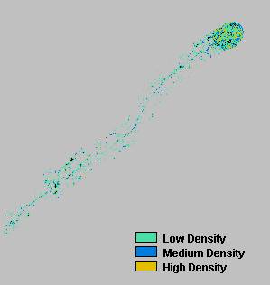
land cover classes to density classes, which is given in Figure 8. Depending on
the density levels, it could be further grouped as low, medium and high density
(Figure 9). The relative share of each category was computed (area and
percentage).
|
|
|
|
Figure 8: Map Density |
Figure 9: Classification of Built-up Densities |
Table
3: Different Densities of Built-up and their Area
|
Category |
Area in sq.
km |
Percentage |
|
Low density |
30.099
|
64.11
% |
|
Medium
density |
10.711
|
22.81
% |
|
High density |
6.138
|
13.08
% |
High density
of built-up would refer to clustered or more compact nature of the built-up
theme, while medium density would refer to relatively lesser compact built-up
and low density referred to loosely or sparsely found built-up. The percentage
of high-density built-up area was only 13.08 % as against 22.81 % of medium
density and as much as 64.11 % of low density built-up (Table 3). This revealed
that more compact or highly dense built-up was a smaller amount and more dispersed
or least dense built-up was larger in the study area. An important inference
that could be drawn out of this was that high and medium density was found all
along the highways along with the city centres. Most of the high density was
found to be within and closer to the towns and cities. The medium density was
also found mostly along the city periphery and on the highways. The distribution
of the low density was the maximum in the study area and this could be inferred
as the higher dispersion of the built-up in the study area. This further substantiates
the results of Shannon's entropy, which revealed a dispersion of the built-up
theme in the study area.
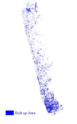
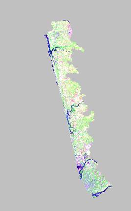
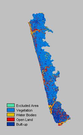
7.2 STUDY AREA 2 - TIRUCHIRAPALLI - TANJAVORE – KUMBAKONAM – Thiruvarur HIGHWAY
7.2.1. Image Analyses
The built-up
area for 1972 was extracted from the digitised toposheets and is shown in Figure
10. The standard image processing techniques such as, image extraction, rectification,
restoration, and classification were applied in the current study. The image
obtained from the NRSA in three bands, viz., Band 2 (green), Band 3 (red) and
Band 4 (near infrared), were used to create a False Colour Composite (FCC) as
shown in Figure 11. Based on the histogram, corresponding to various peaks,
the number of clusters for image classification was done using Guassian Maximum
Likelihood Classifier and the built-up theme identified in the classified image
is given in Figure 12. The built-up area computed for temporal data indicated
that there was 133.93 % increase in the built-up area from the seventies to
late nineties (Table 4).
Table
4: Details of Built-up Area for 1972 and 1999
|
|
Built-up
Area 1972 (sq. km) |
Built-up
Area 1999 (sq. km) |
Percentage
Change in Built-up Area from 1972 – 1999 |
|
Region |
82.53 |
159.49 |
93.25
% |
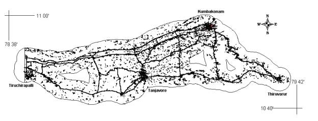
Figure 10: Built-up Area of the Region along with the Road Network for 1972
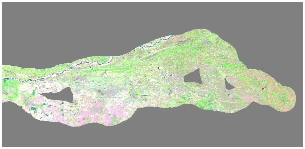
Figure 11: False Colour Composite of the Region
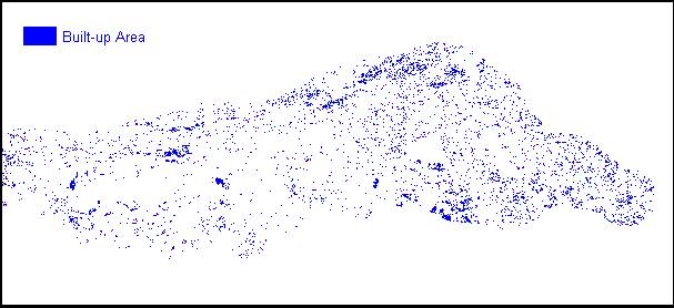
Figure 12: Built-up Area of the Region for 1999
7.3 STUDY AREA 3: UDUPI - MANGALORE HIGHWAY
7.3.1. Image Analyses for LANDSAT TM Image of 1987
The standard
image processing techniques such as, image extraction, rectification, restoration,
and classification were applied to the current image. The Landsat TM 5 data
supplied by NRSA were extracted into the three bands, viz., Green, Red and Near-infrared.
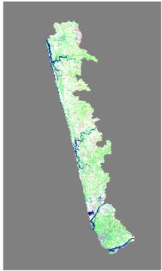
These were used to create a False Colour Composite (FCC) as shown in Figure
13. Training polygons were created along with corresponding attribute data obtained
in the field using GPS and verified with the composite image. Based on these
signatures, corresponding to various land features, image classification was
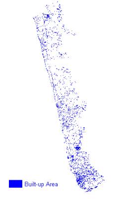
done using Guassian Maximum Likelihood Classifier. The classified image showing
the built-up of 1987 and 1999 are given in Figure 14 and 15.
|
|
|
Figure 13: False Colour Composite of LANDSAT TM 1987 |
|
|
|
|
Figure 14: Built-up Area 1987 |
Figure 15: Built-up Area 1999 |
7.3.2. Image Analyses for IRS LISS III Image of 1999
The standard
image processing techniques such as, image extraction, rectification, restoration,
and classification were applied in the current study. The image obtained from
the NRSA in three bands, viz., Band 2 (green), Band 3 (red) and Band 4 (near
infrared), were used to create a False Colour Composite (FCC) as shown in Figure
16. Training polygons were chosen from the composite image and corresponding
attribute data was obtained in the field using GPS. Based on these signatures,
corresponding to various land features, image classification was done using
Guassian Maximum Likelihood Classifier and the classified image is given in
Figure 17.
|
|
|
|
Figure 16: False Colour Composite – IRS LISS III 1999 |
Figure 17: Classified Image – IRS LISS III 1999 |
7.3.3. Population Growth and Built-up Area
The rate of
development of land in Udupi - Mangalore region, is far outstripping the rate
of population growth. This implies that the land is consumed at excessive rates
and probably in unnecessary amounts as well. The built-up area computed for
temporal data indicated that there was 107.52 % increase in the built-up area
from 1972 to 1987 (Table 5). While the percentage increase from 1987 to 1999
was only 18 %. However the cumulative increase for nearly three decades was
145.68 %. Between 1972 and 1999, population in the region grew by about 54%
(Census of India, 1971; 1981; and 1991) while the amount of developed land grew
by about 146%, or nearly three times the rate of population growth (Figure 18).
This means that the per capita consumption of land has increased markedly over
three decades.
Table
5: Details of Built-up Area for 1972, 1987 and 1999
|
Segment |
Built-up Area (sq. km) |
||
|
1972 |
1987 |
1999 |
|
|
Udupi - Mangalore |
25.1383 |
52.1674 |
61.7603 |
The
per capita land consumption refers to utilisation of all lands for development
initiatives like the commercial, industrial, educational, and recreational establishments
along with the residential establishments per person. Since most of the initiatives
pave way for creation of jobs and subsequently help in earning livelihoods,
the development of land is seen as a direct consequence of region’s economic
development and hence one can conclude that the per capita land consumption
is inclusive of all the associated land development.
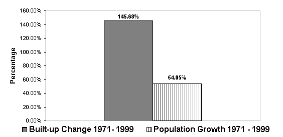
Figure 18: Rates of Growth in Population and Built-up from 1971 - 1999
7.3.4. Metrics of Urban Sprawl
Characterising
pattern involves its detection, quantifying with appropriate scales and summarising
it statistically. There are scores of metrics now available to describe landscape
pattern, but there are still only two major components viz., composition and
structure, and only a few aspects of each of these. The landscape pattern metrics
are used in studying forest patches (Trani and Giles, 1999; Civco, et al., 2002).
Most of the indices are correlated among themselves, because there are only
a few primary measurements that can be made from patches (patch type, area,
edge, and neighbour type), and all metrics are then derived from these primary
measures. The landscape metrics applied to analyse the built-up theme for the
current study is discussed next.
The Shannon's
entropy (Yeh and Li, 2001) was computed to detect the urban sprawl phenomenon.
This value ranges from 0 to log n, indicating very compact distribution for
values closer to 0. The values closer to log n indicates that the distribution
is very dispersed. Larger value of entropy reveals the occurrence of urban
sprawl. Table 5 shows the built-up area, population and Shannon's entropy for
1972 and 1999.
Shannon's
entropy was calculated from the built-up area for each village wherein each
village was considered as an individual zone (n = total number of villages).
From the Shannon's entropy calculation, it revealed that the distribution of
built-up in the region in 1972 was more dispersed than in 1999. However the
degree of dispersion has come down marginally and that distribution is
predominantly dispersed or there is the presence of sprawl. The values obtained
here being 1.7673 in 1972 to 1.673 in 1999, are closer to the upper limit of log
n, i.e. 1.914, thus showing the degree of dispersion of built-up in the region.
Table
6: Built-up Area, Population and Shannon's Entropy for the Study Area
|
Segment |
Built-up
Area (sq. km) |
Population |
Shannon’s
Entropy |
||||
|
1972 |
1999 |
1972 |
1999 |
1972 |
1999 |
Log
N |
|
|
Udupi
- Mangalore |
25.1383 |
61.7603 |
312003 |
483183 |
1.7673 |
1.673 |
1.9138 |
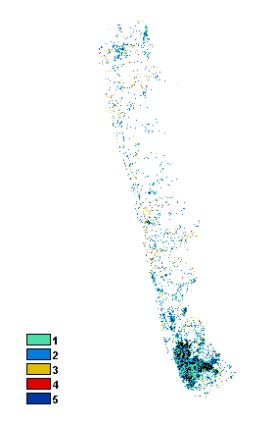
Patchiness or
NDC (Number of Different Classes) is the measurement of the density of patches
of all types or number of clusters within the n x n window. In other words,
it is a measure of the number of heterogeneous polygons over a particular area.
Greater the patchiness more heterogeneous is the landscape (Murphy, 1985). In
this case the density of patches among different categories was computed for
a 3x3 window.
|
|
|
Figure 19: Patchiness or Number of Different Classes |
Table
7: Percentage Distributions of Patchiness
|
Number
of Classes |
Percentage
Distribution |
|
1 |
20.7 |
|
2 |
57.15 |
|
3 |
20.18 |
|
4 |
1.95 |
|
5 |
0.02 |
Map density
values are computed by dividing number of built up pixels to the total number of
pixels in a kernel. This when applied to a classified satellite image converts
land cover classes to density classes, which is given in Figure 20. Depending on
the density levels, it could be further grouped as low, medium and high density
(Figure 21). Based on this, relative share of each categories were computed
(area and percentage). This enabled in identifying different urban growth
centres and subsequently correlating the results with Shannon's entropy for
identifying the regions of high dispersion.
The
computation of built-up density gave the distribution of the high, medium and
low-density built-up clusters in the study area. High density of built-up would
refer to clustered or more compact nature of the built-up theme, while medium
density would refer to relatively lesser compact built-up and low density
referred to loosely or sparsely found built-up. The percentage of high-density
built-up area was only 12.67 % as against 25.67 % of medium density and as much
as 61.66 % of low density built-up (Table 8). This revealed that more compact or
highly dense built-up was a smaller amount and more dispersed or least dense
built-up was larger in the study area. An important inference that could be
drawn out of this was that high and medium density was found all along the
highways along with the city centres. Most of the high density was found to be
within and closer to the cities. However, the medium density was also found
mostly along the city periphery and on the highways. The distribution of the low
density was the maximum in the study area and this could be inferred as the
higher dispersion of the built-up in the study area. This further substantiates
the results of Shannon's entropy, which revealed a high dispersion of the
built-up theme in the study area.
Table
8: Different densities of built-up and their area
|
Category |
Area
in sq. km |
Percentage |
|
Low
density |
93.88 |
61.66
% |
|
Medium
density |
39.08 |
25.67
% |
|
High
density |
19.29 |
12.67
% |
|
|
|
|
Figure 20: Map Density |
Figure 21: Classification of Built-up Densities |
| Energy | CES | IISc | Envis | Envis Node |