 |
 |
 |
|
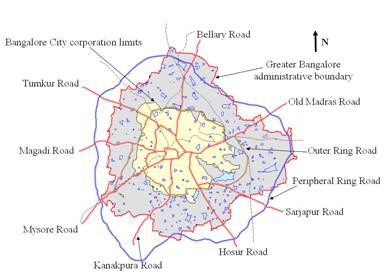
Results and Discussion The supervised classified images of 1973, 1992, 1999, 2000, 2002, 2006 and 2009 with an overall accuracy of 72%, 75%, 71%, 77%, 60%, 73% and 86% were obtained using the open source programs (i.gensig, i.class and i.maxlik) of Geographic Resources Analysis Support System (http://wgbis.ces.iisc.ac.in/grass) as displayed in figure 3. The class statistics is given in table 2. The implementation of the classifier on Landsat, IRS and MODIS image helped in the digital data exploratory analysis as were also verified from field visits in July, 2007 and Google Earth image. From the classified raster maps, urban class was extracted and converted to vector representation for computation of precise area in hectares. There has been a 632% increase in built up area from 1973 to 2009 leading to a sharp decline of 79% area in water bodies in Greater Bangalore mostly attributing to intense urbanisation process. Figure 4 shows Greater Bangalore with 265 water bodies (in 1972). The rapid development of urban sprawl has many potentially detrimental effects including the loss of valuable agricultural and eco-sensitive (e.g. wetlands, forests) lands, enhanced energy consumption and greenhouse gas emissions from increasing private vehicle use (Ramachandra and Shwetmala, 2009). Vegetation has decreased by 32% from 1973 to 1992, by 38% from 1992 to 2002 and by 63% from 2002 to 2009. Disappearance of water bodies or sharp decline in the number of waterbodies in Bangalore is mainly due to intense urbanisation and urban sprawl. Many lakes (54%) were unauthorised encroached for illegal buildings. Field survey (during July-August 2007) shows that nearly 66% of lakes are sewage fed, 14% surrounded by slums and 72% showed loss of catchment area. Also, lake catchments were used as dumping yards for either municipal solid waste or building debris. The surrounding of these lakes have illegal constructions of buildings and most of the times, slum dwellers occupy the adjoining areas. At many sites, water is used for washing and household activities and even fishing was observed at one of these sites. Multi-storied buildings have come up on some lake beds that have totally intervene the natural catchment flow leading to sharp decline and deteriorating quality of waterbodies. This is correlated with the increase in built up area from the concentrated growth model focusing on Bangalore, adopted by the state machinery, affecting severely open spaces and in particular waterbodies. Some of the lakes have been restored by the city corporation and the concerned authorities in recent times.
Table 2: Greater Bangalore LC statistics
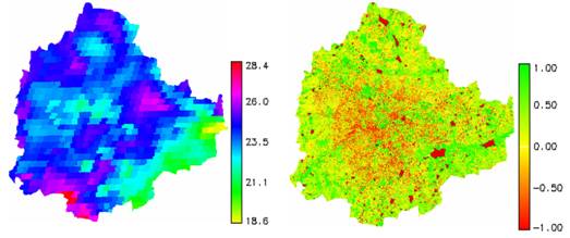
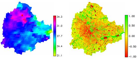
LST were computed from Landsat TM and ETM thermal bands. The minimum and maximum temperature from Landsat TM data of 1992 was 12 and 21 with a mean of 16.5±2.5 while for ETM+ data was 13.49 and 26.32 with a mean of 21.75±2.3. MODIS Land Surface Temperature/Emissivity (LST/E) data with 1 km spatial resolution with a data type of 16-bit unsigned integer were multiplied by a scale factor of 0.02 (http://lpdaac.usgs.gov/modis/dataproducts.asp#mod11). The corresponding temperatures for all data were converted to degree Celsius. Figure 5 shows the LST map and NDVI of Greater Bangalore in 1992, 2000 and 2007. The minimum (min) and maximum (max) temperatures were computed as 20.23, 28.29 and 23.79, 34.29 with a mean of 23.71±1.26, 28.86± 1.60 for 2000 and 2007 respectively. Data were calibrated with in-situ measurements. NDVI was computed to study its relationship with LST. The Landsat TM NDVI had a mean of 0.04±0.4543, ETM+ data had a mean of 0.0252±0.5369 and MODIS had a mean of -0.0917±0.5131.
The correlation between NDVI and temperature of 1992 TM data was 0.88, 0.72 for MODIS 2000 and 0.65 for MODIS 2007 data respectively, suggesting that the extent of LC with vegetation plays a significant role in the regional LST. Respective NDVI and LST for different land uses is given in table 3 and further analysis was carried out to understand the role of respective land uses in the regional LST’s. Table 3: LST ( oC) and NDVI for various land uses.
It is clear that urban areas that include commercial, industrial and residential land exhibited the highest temperature followed by open ground. The lowest temperature was observed in water bodies across all years and vegetation. Spatial variation of NDVI is not only subject to the influence of vegetation amount, but also to topography, slope, solar radiation availability, and other factors (Walsh et al., 1997). The relationship between LST and NDVI was investigated for each LC type through the Pearson’s correlation coefficient at a pixel level and are listed in table 4. The significance of each correlation coefficient was determined using a one-tail Student’s t-test. It is apparent that values tend to negatively correlate with NDVI for all LC types. NDVI values for built up ranges from -0.05 to -0.6. Temporal increase in temperature with the increase in the number of urban pixels during 1992 to 2009 (113%) is confirmed with the increase in ‘r’ values for the respective years. The NDVI for vegetation ranges from 0.15 to 0.6. Temporal analyses of the vegetation show a decline of 65%, with a consequent increase in the temperature. Table 4: Correlation coefficients between LST and NDVI by LC type (p=0.05)
A closer look at the values of NDVI by LULC category (table 3) indicates that the relationship between LST and NDVI may not be linear. Clearly, it is necessary to further examine the existing LST and vegetation abundance relationship using fraction as an indicator. The abundance images using linear unmixing from ETM+ bands were further analysed to see their contribution to the UHI by separating the pixels that contains 0-20%, 20-40%, 40-60%, 60-80% and 80-100% of urban pixels. Table 5 gives the average LST for various land use classes. Table 5: Mean LST for various land use classes for different abundances
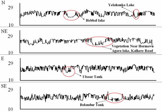
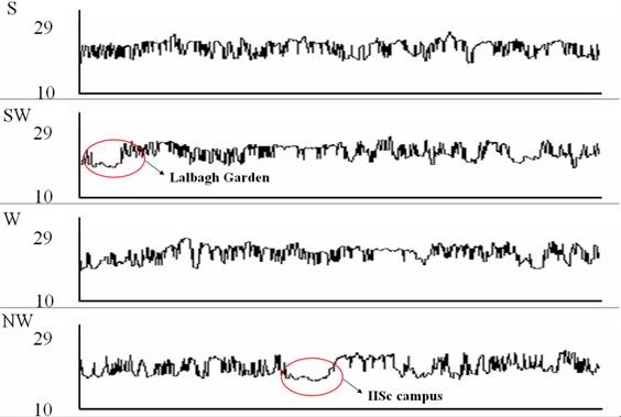
8 transacts were laid across the city in different directions (north [N], north-east [NE], east [E], south-east [SE], south [S], south-west [SW], west [W] and north-west [NW]) and LST was analysed as shown in figure 6, to understand the temperature dynamics.
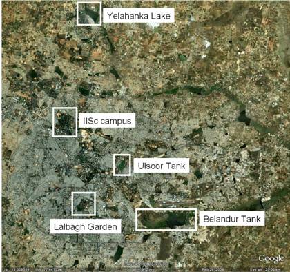
The temperature profile was analysed by overlaying the LST map on the Baye’s classified map to visualise the effect of vegetation, builtup, water bodies and open ground. The temperature profile plot fell below the mean when a vegetation patch or water body was encountered on the transact beginning from the center of the city and moving outwards along the transact. The corresponding graphs are shown in figure 7. The major natural green area and water bodies responsible for temperature decline are marked with circle. The spatial location of these green areas and water bodies are shown in figure 8.
|
||||||||||||||||||||||||||||||||||||||||||||||||||||||||||||||||||||||||||||||||||||||||||||||||||||||||||||||||||||||||||||||||||||||||||||||||||||||||||||||||||||||||


.jpg)
| E-mail | Sahyadri | ENVIS | GRASS | Energy | CES | CST | CiSTUP | IISc | E-mail |