Results of the GRASS GIS student grants - Part 1
Linda’s path in her own words
From enhancing first time user experience to Single-Window in GRASS GIS
I started contributing to GRASS GIS in the summer of 2020 as part of the Google Summer of Code (GSoC) project “Creation of a new GRASS GIS startup mechanism”, which I applied for as a complete programming illiterate. Although I felt a bit clumsy at first, with the great help of my mentors, I managed to significantly improve the GRASS data catalog. Looking back now, this was the starting point for all the upcoming fundamental changes in the graphical user interface (GUI).
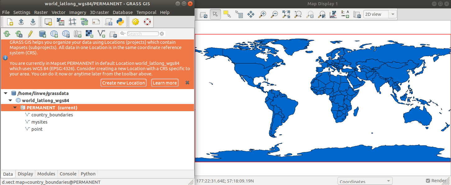
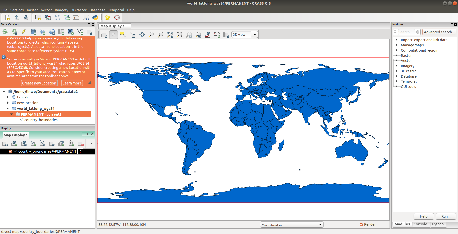
In the following months, as part of my master thesis, I focused on the topic of a new startup mechanism and the improvement of the first-time user experience. The whole effort led to eliminating the hard-to-grasp startup screen and implementing a new first-time user mode, which made GRASS significantly more accessible to new users.
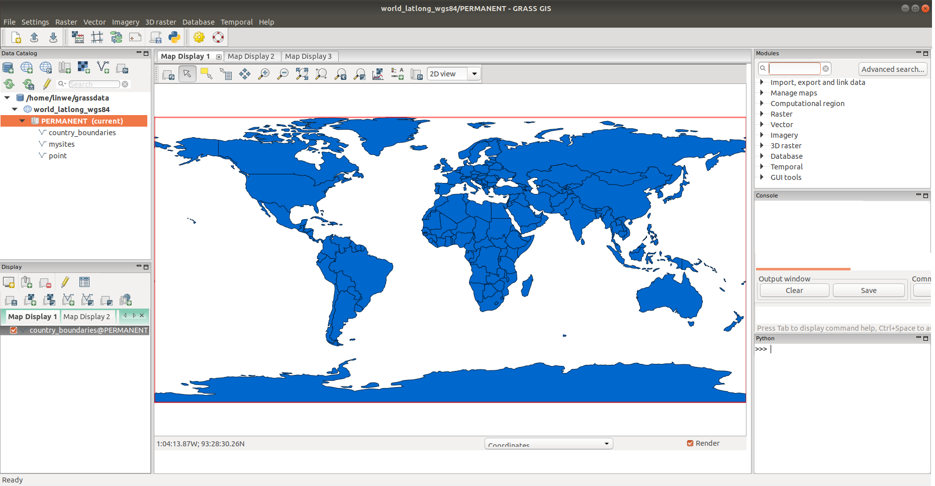
What helped a lot in steering the further implementations were the online community surveys I created as part of my master thesis. Thanks to them, other thorny topics emerged among which I was mostly interested in the need to unify GRASS into a Single-Window layout. From the very beginning, I wanted to make working with GRASS as pleasant as possible, but until then I had largely focused on new users. I realized that implementing Single-Window would be rather difficult, requiring significant refactoring of large part of the GUI code. Therefore, recalling the great experience from GSoC 2020, I eventually decided to create a mock-up graphic design, which was then the basis for a successful application to the next GSoC.
Based on the illustration, my mentors and I managed to rewrite part of the internal logic of the existing Multi-Window GUI, so that we were able to start building a new interface next to it. A very simple Single-Window prototype was created within GSoC 2021, but it was still buggy (See details in the project wiki). The fall of 2021 was therefore marked by minor edits that culminated in merging a new Single-Window GUI to the main development branch. In this way, advanced users working with the development version could try the BETA version of the new GUI.
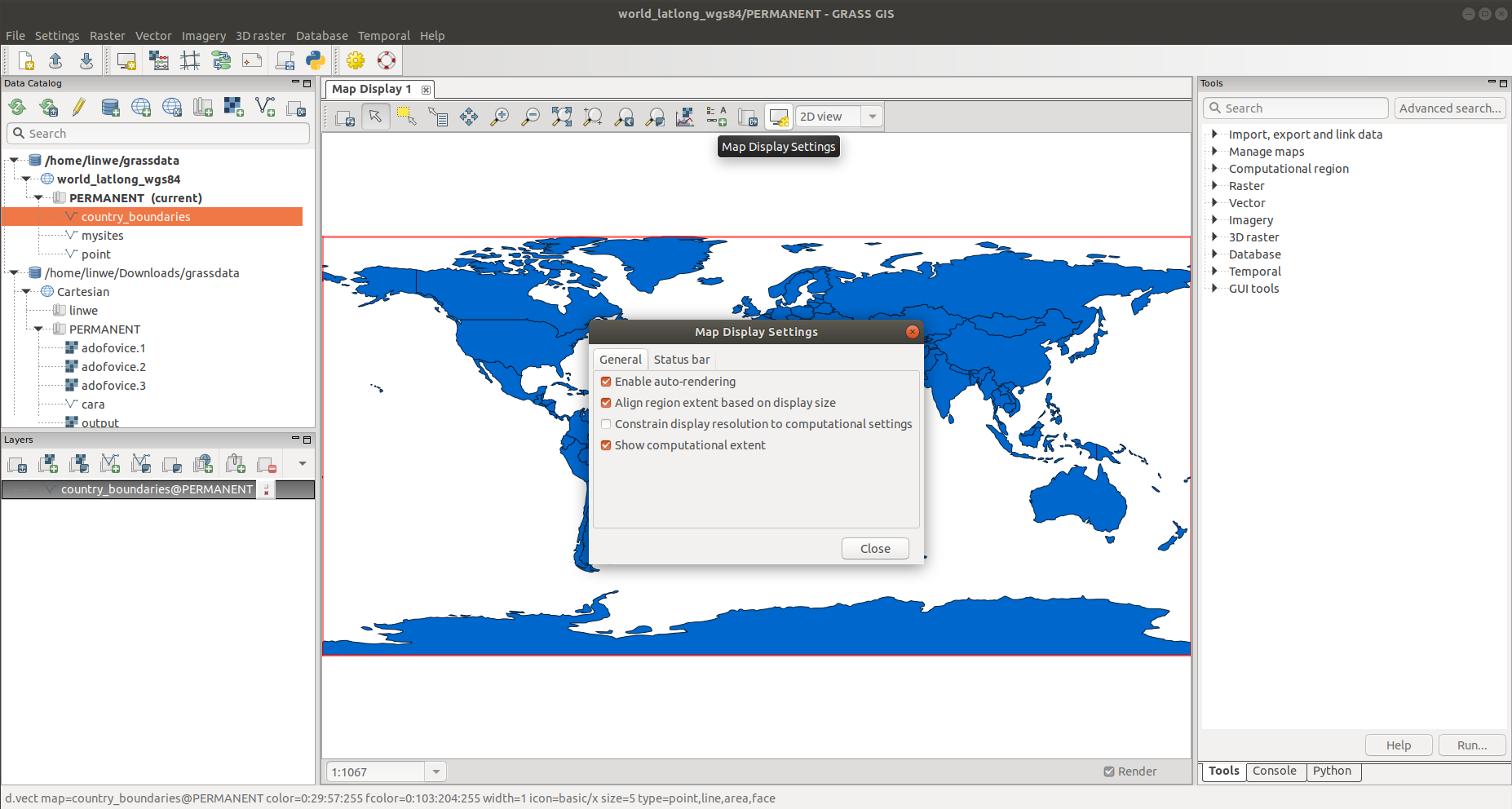
Soon, of course, there were suggestions for further improvements since the Single-Window GUI revealed on a larger scale some shortcomings that were not so significant in the Multi-Window GUI. Specifically, the crowded status bar was perceived as the biggest problem. Fortunately, at that time, GRASS announced a call for student grants to work on Mini-projects. I applied, of course, and this was the third project related to GRASS GUI that I have worked on. The student grant allowed me to dedicate time to create a clearer status bar in the map window and a new Map Display Settings dialog.
Although there is still room for improvement, I believe that the new startup mechanism together with the Single-Window GUI user interface is a new era for GRASS GIS, as it lowers the entry barrier for GIS beginners and generally enhances the user experience among GIS professionals.


